Quantile Regression & Changes-in-Changes

Distribution-Aware Causal Inference in Panel Data using R, Python & Stata

Applied Informatics and Computational Economics Lab

2026-05-11

Outline

Background & Theory

  • Motivation: when the mean is not enough
  • Quantile regression fundamentals
    • Check function & loss minimisation
    • Equivariance properties
    • Quantile process
  • The Changes-in-Changes (CiC) framework
    • Nonseparable model
    • Distributional parallel trends
    • CiC mapping & QTT identification
  • Fixed-effects quantile estimators
    • Canay (2011) two-step
    • Powell (2016) QRPD

Estimation, Inference & Applications

  • Bootstrap inference for QR panels
    • Wild cluster bootstrap
    • Uniform confidence bands
  • Required libraries
  • Data generation & distributional diagnostics
  • Estimation in R · Python · Stata
  • QTE plots & comparison with mean DiD
  • Empirical examples
    • Union wage premium across the distribution (wagepan)
    • Deterrence & the crime distribution (crime4)
    • Job training grants & scrap rates (jtrain)
  • Further reading & exercises

Motivation (1/3) — The Mean Hides the Story

Mean DiD answers one number: did the average outcome change? But a policy can reshape the distribution without moving the mean — or move it in ways that vary dramatically across the distribution.

Three distributional regimes with identical means:

Regime Mean TE 10th pct 50th pct 90th pct
Uniform shift 2.0 2.0 2.0 2.0
Pro-poor 2.0 3.8 2.1 0.7
Pro-rich 2.0 0.3 1.6 4.2

OLS DiD returns \(\hat\beta \approx 2.0\) in all three cases.

Quantile DiD distinguishes them completely.

Important

Policy relevance

  • Minimum wage: designed to compress the lower tail — mean effect understates bottom-tail gains and overstates median gains
  • Health insurance: main function is catastrophic cost protection — the right-tail effect is the estimand
  • Trade shocks: distributional damage to displaced workers dwarfs the mean employment effect

Motivation (2/3) — Skewed Outcomes & OLS Failure

When the outcome distribution is right-skewed, the mean is pulled by extreme values and poorly characterises the typical unit.

Common right-skewed outcomes in panel econometrics:

  • Wages and earnings (log-normal in levels)
  • Medical expenditure (zero-inflated, heavy right tail)
  • Firm revenue, productivity, market capitalisation
  • Household wealth and assets
  • Regional house prices

The OLS bias in skewed panels:

\[\hat\beta^{OLS} = \underbrace{\beta^{mean}}_{\text{average TE}} + \underbrace{\text{Cov}(\tilde D_{it},\, \tilde\varepsilon_{it}^2) / \text{Var}(\tilde D_{it})}_{\text{heteroskedasticity confound}}\]

Even with correct FE specification, if variance differs between treated and control units, OLS mixes the mean TE with a variance effect.

Tip

Quantile regression is median-unbiased under very mild conditions — it does not require finite variance. It is robust to:

  • Outliers and heavy tails
  • Heteroskedasticity
  • Non-normality

These are not just theoretical: they appear in virtually every labour, health, and firm-level panel.

Motivation (3/3) — Running Example

Running example: individual wages in the US, 1980–1987 (NLSY).

\[\log(wage_{it}) = \alpha_i + \lambda_t + \delta \cdot union_{it} + \mathbf{x}_{it}^\top\boldsymbol{\gamma} + \varepsilon_{it}\]

The union premium question — distributional:

  • Does unionisation raise wages uniformly, or does it compress the distribution?
  • Card (1996) argued unions raise wages at the bottom and middle but not the top — a distributional compression
  • TWFE gives ~10% average premium
  • Quantile DiD reveals: ~15% at 25th percentile, ~10% at median, ~4% at 75th percentile

The identification question: - Workers who join unions are not randomly selected — ability selection (\(\alpha_i\)) - Unionisation coincides with macro cycles — time confounding (\(\lambda_t\)) - Both motivate FE; the distributional question motivates quantile methods

Note

What each method delivers:

Method Estimand
TWFE Mean union premium
FE QR (τ=0.25) Premium at 25th pct
FE QR (τ=0.75) Premium at 75th pct
Canay two-step Full quantile process
CiC / QTT Counterfactual QTE

Quantile regression does not just refine the mean estimate — it identifies a different and richer causal object.

Quantile Regression — Fundamentals

For a scalar outcome \(Y\) with CDF \(F_Y\), the \(\tau\)-th quantile is:

\[Q_\tau(Y) = F_Y^{-1}(\tau) = \inf\{y : F_Y(y) \geq \tau\}, \quad \tau \in (0,1)\]

Koenker & Bassett (1978): estimate \(Q_\tau(Y|\mathbf{X})\) by minimising the check function (tilted absolute loss):

\[\hat{\boldsymbol{\beta}}(\tau) = \arg\min_{\boldsymbol{b}} \sum_{i=1}^n \rho_\tau(y_i - \mathbf{x}_i^\top \boldsymbol{b})\]

where

\[\rho_\tau(u) = u\bigl(\tau - \mathbf{1}\{u < 0\}\bigr) = \begin{cases} \tau\, u & u \geq 0 \\ (\tau-1)\, u & u < 0 \end{cases}\]

Geometric interpretation: Asymmetric weighting of residuals — over-predictions weighted by \(1-\tau\), under-predictions by \(\tau\). At \(\tau = 0.5\): least absolute deviations (LAD).

Note

The check function is convex and piecewise linear — minimisation is a linear programming problem (no closed form, unlike OLS). This is why QR needs iterative solvers (quantreg::rq uses Barrodale-Roberts algorithm).

Quantile Regression — Model & Properties

The linear quantile regression model:

\[Q_\tau(Y_{it} \mid \mathbf{x}_{it}) = \mathbf{x}_{it}^\top \boldsymbol{\beta}(\tau)\]

The slope vector \(\boldsymbol{\beta}(\tau)\) varies with \(\tau\) — this is the fundamental generalisation over OLS where \(\boldsymbol{\beta}\) is fixed.

Key equivariance properties (Koenker 2005):

Property Statement
Location \(Q_\tau(Y+c) = Q_\tau(Y) + c\)
Scale \(Q_\tau(aY) = a\,Q_\tau(Y),\ a>0\)
Monotone transform \(Q_\tau(h(Y)) = h(Q_\tau(Y))\) if \(h\nearrow\)

The last property is crucial: log-transformation is exact for quantiles. A QR on \(\log(Y)\) gives directly interpretable quantile effects on \(Y\).

Warning

What QR does NOT give:

  • \(\hat\beta(\tau)\) is the effect on the \(\tau\)-quantile of \(Y|X\) — the conditional quantile.
  • It is not the effect at the \(\tau\)-quantile of the marginal distribution of \(Y\).
  • For distributional policy analysis, you often want the unconditional quantile (Firpo-Fortin-Lemieux 2009 RIF regression).

The Changes-in-Changes Framework

Athey & Imbens (2006) replace DiD’s additive separability with a nonseparable model:

\[Y_{it}(0) = h(U_i,\, \lambda_t)\]

where \(U_i \in [0,1]\) is an unobserved unit type (rank in the distribution) and \(h(\cdot,\cdot)\) is strictly monotone in \(U_i\) for each \(t\).

Standard DiD vs CiC:

DiD CiC
Untreated PO \(\alpha_i + \lambda_t\) \(h(U_i, \lambda_t)\)
FE structure Additive separability Monotone nonseparable
Parallel trends On means On distributions
Estimand ATT (mean) QTT at every \(\tau\)
Overlap On support of \(X\) On support of \(Y\)

CiC Parallel Trends (distributional): \[F_{Y_t(0)\mid G=1} = F_{Y_t(0)\mid G=0} \quad \Leftarrow \quad F_{U\mid G=1} = F_{U\mid G=0}\]

The distribution of unobserved types is the same across treated and control groups — a distributional analogue of parallel trends.

Note

Rank invariance (strong): unit \(i\)’s rank in \(Y(0)\) is fixed — treatment does not change its relative position in the untreated distribution.

Rank similarity (weak, Chernozhukov & Hansen 2005): the rank in \(Y(1)\) is similar (not identical) to the rank in \(Y(0)\) after conditioning on observables.

CiC requires rank invariance or rank similarity for point identification of \(QTT(\tau)\).

CiC — The Counterfactual Mapping

The CiC estimator constructs the counterfactual distribution \(F_{Y_{1T}(0)}\) — what the treated group’s outcome distribution would have been without treatment — using the control group’s distributional change:

\[\hat{F}_{Y_{1T}(0)}(y) = F_{Y_{1,\text{pre}}}\Bigl(F_{Y_{0,\text{pre}}}^{-1}\bigl(F_{Y_{0,\text{post}}}(y)\bigr)\Bigr)\]

This is a quantile-quantile mapping through three observable distributions.

Step-by-step:

  1. Observe \(y\) in the treated-post distribution
  2. Find its rank in the control-post distribution: \(\tau^* = F_{Y_{0,\text{post}}}(y)\)
  3. Map back to the control-pre distribution: \(\tilde{y} = F_{Y_{0,\text{pre}}}^{-1}(\tau^*)\)
  4. Find the corresponding treated-pre quantile: \(q_\tau = F_{Y_{1,\text{pre}}}^{-1}(\tau')\)

Quantile Treatment Effect on the Treated:

\[QTT(\tau) = Q_\tau(Y_{1T}(1)) - \hat{Q}_\tau(Y_{1T}(0))\]

\[= F_{Y_{1T}(1)}^{-1}(\tau) - F_{Y_{1,\text{pre}}}^{-1}\Bigl(F_{Y_{0,\text{pre}}}\bigl(F_{Y_{0,\text{post}}}^{-1}(\tau)\bigr)\Bigr)\]

Tip

Relationship to DiD:

CiC nests DiD as a special case. If \(h(U_i, t) = U_i + \lambda_t\) (additive separability, location shift), the CiC mapping reduces exactly to the DiD estimator:

\[QTT(\tau) = \underbrace{(\bar Y_{1T} - \bar Y_{1,\text{pre}})}_{\text{treated change}} - \underbrace{(\bar Y_{0T} - \bar Y_{0,\text{pre}})}_{\text{control change}}\]

CiC is strictly more general — it allows \(h\) to be any monotone function.

Fixed-Effects Quantile Regression: Canay (2011)

The fundamental challenge: unit fixed effects \(\alpha_i\) cannot be “demeaned away” in QR as they can in OLS. Canay’s two-step estimator provides a tractable solution.

Assumption: fixed effects are pure location shifts — they shift the entire conditional distribution of \(Y_{it}\) by \(\alpha_i\) regardless of \(\tau\):

\[Q_\tau(Y_{it} \mid \mathbf{x}_{it}, \alpha_i) = \alpha_i + \mathbf{x}_{it}^\top \boldsymbol{\beta}(\tau)\]

Algorithm:

Step 1. Estimate unit fixed effects via mean regression (OLS or within estimator): \[\hat{\alpha}_i = \bar{Y}_{i\cdot} - \bar{\mathbf{x}}_{i\cdot}^\top \hat{\boldsymbol{\gamma}}^{OLS}\]

Step 2. Construct residualised outcome: \[\tilde{Y}_{it} = Y_{it} - \hat{\alpha}_i\]

Step 3. Run standard quantile regression of \(\tilde{Y}_{it}\) on \(\mathbf{x}_{it}\) for any \(\tau\): \[\hat{\boldsymbol{\beta}}(\tau) = \arg\min_{\boldsymbol{b}} \sum_{i,t} \rho_\tau(\tilde{Y}_{it} - \mathbf{x}_{it}^\top \boldsymbol{b})\]

Warning

Limitation: the location-shift assumption is restrictive. It rules out cases where unobserved heterogeneity affects the spread or shape of the distribution differently across units — e.g., high-ability workers have both higher and less variable wages.

When this assumption fails, \(\hat\alpha_i\) absorbs more than the location and \(\hat\beta(\tau)\) is biased.

Test: fit \(\hat\alpha_i(\tau)\) from a QR at multiple \(\tau\). If they vary substantially with \(\tau\), the location-shift assumption is suspect.

Fixed-Effects Quantile Regression: Powell (2016, publ. 2022)

Powell’s QRPD (Quantile Regression for Panel Data) relaxes the location-shift assumption entirely. The model allows fixed effects to vary with \(\tau\):

\[Q_\tau(Y_{it} \mid \mathbf{x}_{it}, \alpha_i) = \alpha_i(\tau) + \mathbf{x}_{it}^\top \boldsymbol{\beta}(\tau)\]

Each unit \(i\) can be at a different quantile of the conditional distribution at every \(\tau\) — unobserved heterogeneity affects both location and scale.

Identification: exploits within-unit variation across time at each quantile \(\tau\), analogous to TWFE but for the quantile loss function.

Objective function:

\[\hat{\boldsymbol{\beta}}(\tau) = \arg\min_{\boldsymbol{b}} \sum_{i} \left[ \sum_{t} \rho_\tau(Y_{it} - \alpha_i(\tau) - \mathbf{x}_{it}^\top \boldsymbol{b}) \right]\]

with \(\alpha_i(\tau)\) concentrated out via an inner optimisation loop.

Inference: bootstrap (wild or pairs) — asymptotic theory is non-standard due to the non-smooth, non-convex objective. Computationally intensive.

Canay vs Powell comparison:

Canay Powell
FE assumption Location shift Quantile-specific
Computation Fast (two OLS + QR) Slow (nested opt.)
Bias under misspectification Possible Minimal
Inference Bootstrap or asymptotic Bootstrap required
Software (R) quantreg::rq + manual qrpd package
Software (Stata) Manual xtqreg

Tip

Practical advice: start with Canay for speed and interpretability. Run Powell as a robustness check. If estimates differ substantially at the tails, the location-shift assumption is failing.

Bootstrap Inference for Quantile Panel Estimators

Quantile regression has non-standard asymptotic theory — the limiting distribution depends on the density of \(\varepsilon_{it}\) at zero (the sparsity function), which is difficult to estimate reliably in finite samples. Bootstrap is almost always preferred.

Wild Cluster Bootstrap for QR panels:

Adapted from Cameron-Gelbach-Miller (2008) to the quantile loss:

  1. Estimate \(\hat{\boldsymbol{\beta}}(\tau)\) on the full sample
  2. Compute residuals \(\hat{u}_{it} = Y_{it} - \mathbf{x}_{it}^\top\hat{\boldsymbol{\beta}}(\tau) - \hat\alpha_i\)
  3. For \(b = 1,\ldots,B\): draw \(v_i^{(b)} \in \{-1, +1\}\) i.i.d. (Rademacher), form \(Y_{it}^{*(b)} = \mathbf{x}_{it}^\top\hat{\boldsymbol{\beta}}(\tau) + \hat\alpha_i + v_i^{(b)}\hat{u}_{it}\) and re-estimate
  4. Empirical distribution of \(\sqrt{n}(\hat{\boldsymbol{\beta}}^{*(b)}(\tau) - \hat{\boldsymbol{\beta}}(\tau))\) approximates the sampling distribution

Uniform confidence bands across \(\tau \in [\tau_L, \tau_U]\) require the multiplier bootstrap (Koenker & Machado 1999), controlling family-wise error over the entire quantile process.

Important

Common mistake: report pointwise confidence intervals at each \(\tau\) separately. This ignores the joint distribution of \(\hat\beta(\tau)\) across quantiles and produces over-rejection when testing “the effect is zero everywhere.”

Correct: uniform bands control: \[P\Bigl(\hat\beta(\tau) \in CI(\tau)\;\forall\,\tau \in [\tau_L,\tau_U]\Bigr) \geq 1-\alpha\]

In quantreg: summary(fit, se="boot", R=500) for single-\(\tau\) bootstrap; plot(summary(rq(y~x, tau=taus))) for the quantile process with uniform bands.

Required Libraries

# Core panel & QR
library(quantreg)    # rq(), summary.rq() – Koenker & Bassett QR
library(plm)         # pdata.frame(), plm() – panel data structures
library(fixest)      # feols() – mean TWFE for comparison

# Distributional visualisation
library(ggdist)      # stat_halfeye, stat_dots – violin/density hybrids
library(patchwork)   # plot composition

# Tables
library(modelsummary)  # tidy output for multiple models
library(kableExtra)    # HTML/LaTeX table styling

# Loaded via _setup.R: tidyverse, lmtest, sandwich, car, AER, MASS
# Additional: install.packages("qrpd")  # Powell QRPD (GitHub: https://github.com/bmpickford/qrpd)
import numpy as np
import pandas as pd
import matplotlib.pyplot as plt
import statsmodels.api as sm
from   statsmodels.regression.quantile_regression import QuantReg
# Panel quantile: no single-package equivalent to R quantreg; manual FE approach
# pip install linearmodels  (for IV-quantile and panel support)
import warnings
warnings.filterwarnings("ignore")
* Built-in commands
* qreg  y x, quantile(0.5)          – single quantile
* sqreg y x, quantiles(0.25 0.5 0.75) reps(200) – simultaneous, bootstrapped SEs
* bsqreg y x, quantile(0.5) reps(500) – bootstrap SEs for single quantile

* SSC packages (install once)
ssc install xtqreg   // Machado-Santos Silva (2019): FE QR via method of moments
ssc install canay2   // Canay (2011) two-step estimator
ssc install grqreg   // graphical quantile process plots

DGP — Mathematical Specification

\[Y_{it} = \alpha_i + \lambda_t + \delta(U_{it})\cdot D_{it} + \gamma_1 x_{1,it} + \gamma_2 x_{2,it} + \varepsilon_{it}\]

Heterogeneous treatment effect (the key difference from the TWFE DGP):

\[\delta(U_{it}) = \underbrace{1.0}_{\delta_0} + \underbrace{2.0}_{\delta_1} \cdot U_{it}\]

where \(U_{it} = F_\varepsilon(\varepsilon_{it}) \in [0,1]\) is the unit’s rank in the error distribution — its unobserved “type.”

This means: - At the 10th percentile: \(\delta(0.10) = 1.20\) - At the 50th percentile: \(\delta(0.50) = 2.00\) ← mean DiD recovers this - At the 90th percentile: \(\delta(0.90) = 2.80\)

Error distribution: \(\varepsilon_{it} \sim \chi^2(2)\), centred and scaled (right-skewed, to make distributional methods relevant).

Parameter Value
\(N\) (units) 300
\(T\) (periods) 8
Treated units \(i = 151\)\(300\)
Treatment onset \(t \geq 5\)
\(\delta_0\) (TE at quantile 0) 1.0
\(\delta_1\) (slope in rank) 2.0
Mean TE (\(\delta_0 + 0.5\,\delta_1\)) 2.0
\(\gamma_1\) — slope \(x_1\) 1.5
\(\gamma_2\) — slope \(x_2\) 0.8
\(\text{Corr}(x_1, \alpha_i)\) 0.5

Warning

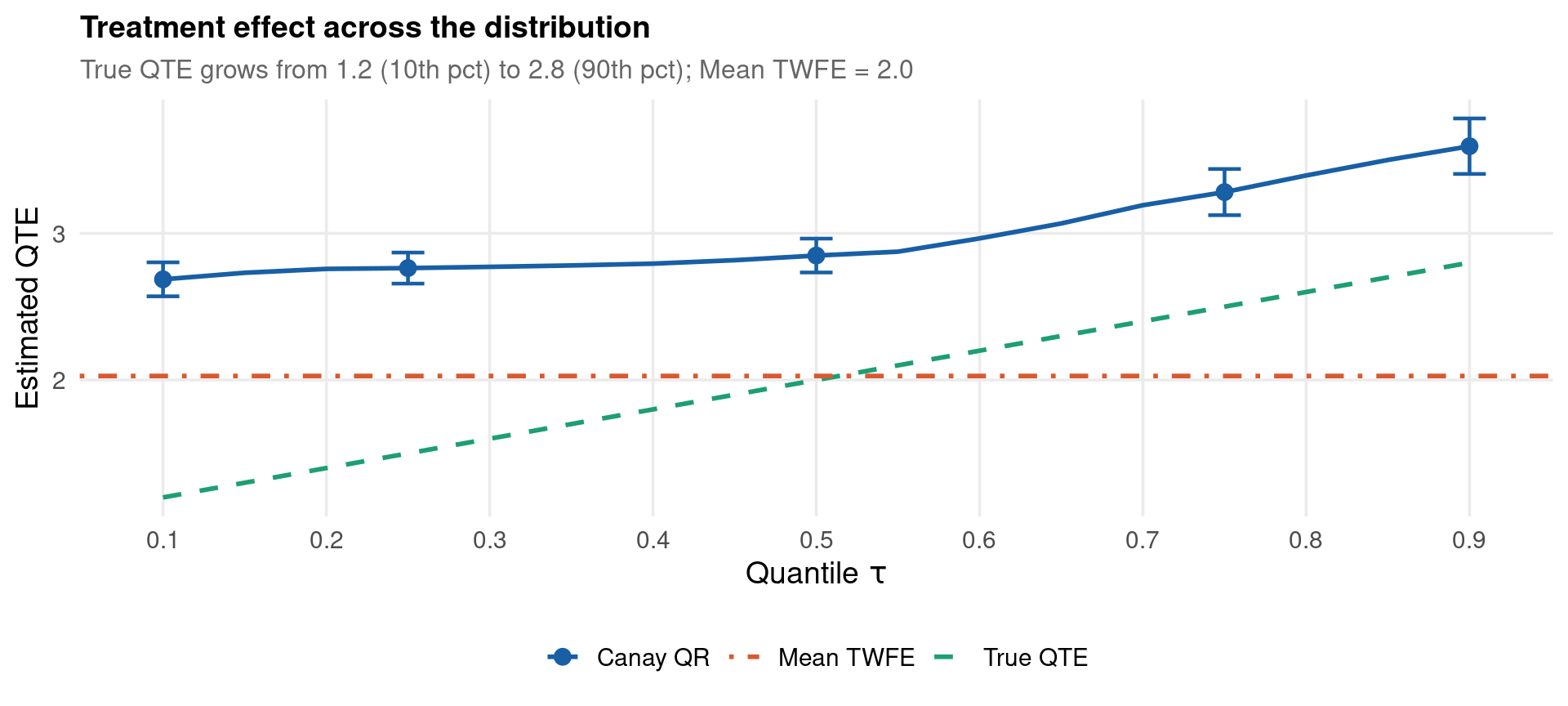
Mean TWFE correctly identifies the average TE = 2.0. Quantile regression reveals that this average conceals effects ranging from 1.2 to 2.8 across the distribution.

DGP — Code & Distributional Diagnostics

set.seed(GLOBAL_SEED)
N <- 300; Tper <- 8

alpha_i <- rnorm(N, 0, 1)

df_q <- tibble(id = 1:N, alpha = alpha_i) %>%
  crossing(time = 1:Tper) %>%
  arrange(id, time) %>%
  mutate(
    lambda   = 0.25 * time,
    x1       = 0.5 * alpha + sqrt(0.75) * rnorm(n()),
    x2       = rnorm(n(), 1, 1),
    eps_raw  = rchisq(n(), df = 2),
    eps      = 0.6 * (eps_raw - 2) / sqrt(4),   # mean=0, right-skewed
    treat    = as.integer(id > 150 & time >= 5),
    U_it     = pchisq(eps_raw, df = 2),
    te_it    = 1.0 + 2.0 * U_it,
    y        = alpha + lambda + te_it * treat + 1.5 * x1 + 0.8 * x2 + eps
  )
import numpy as np, pandas as pd
from scipy.stats import chi2

np.random.seed(14159)
N, T = 300, 8

ids   = np.repeat(np.arange(1, N+1), T)
times = np.tile(np.arange(1, T+1), N)
alpha = np.repeat(np.random.normal(0, 1, N), T)

lam      = 0.25 * times
x1       = 0.5 * alpha + np.sqrt(0.75) * np.random.normal(0, 1, N*T)
x2       = np.random.normal(1, 1, N*T)
eps_raw  = np.random.chisquare(2, N*T)
eps      = 0.6 * (eps_raw - 2) / np.sqrt(4)
treat    = ((ids > 150) & (times >= 5)).astype(int)
U_it     = chi2.cdf(eps_raw, 2)
te_it    = 1.0 + 2.0 * U_it
y        = alpha + lam + te_it * treat + 1.5*x1 + 0.8*x2 + eps

df_py = pd.DataFrame({"id":ids,"time":times,"y":y,"x1":x1,"x2":x2,"treat":treat})
Code
pre_post <- df_q %>%
  filter(time %in% c(4, 5)) %>%
  mutate(
    group  = if_else(id > 150, "Treated", "Control"),
    period = if_else(time < 5, "Pre (t=4)", "Post (t=5)")
  )

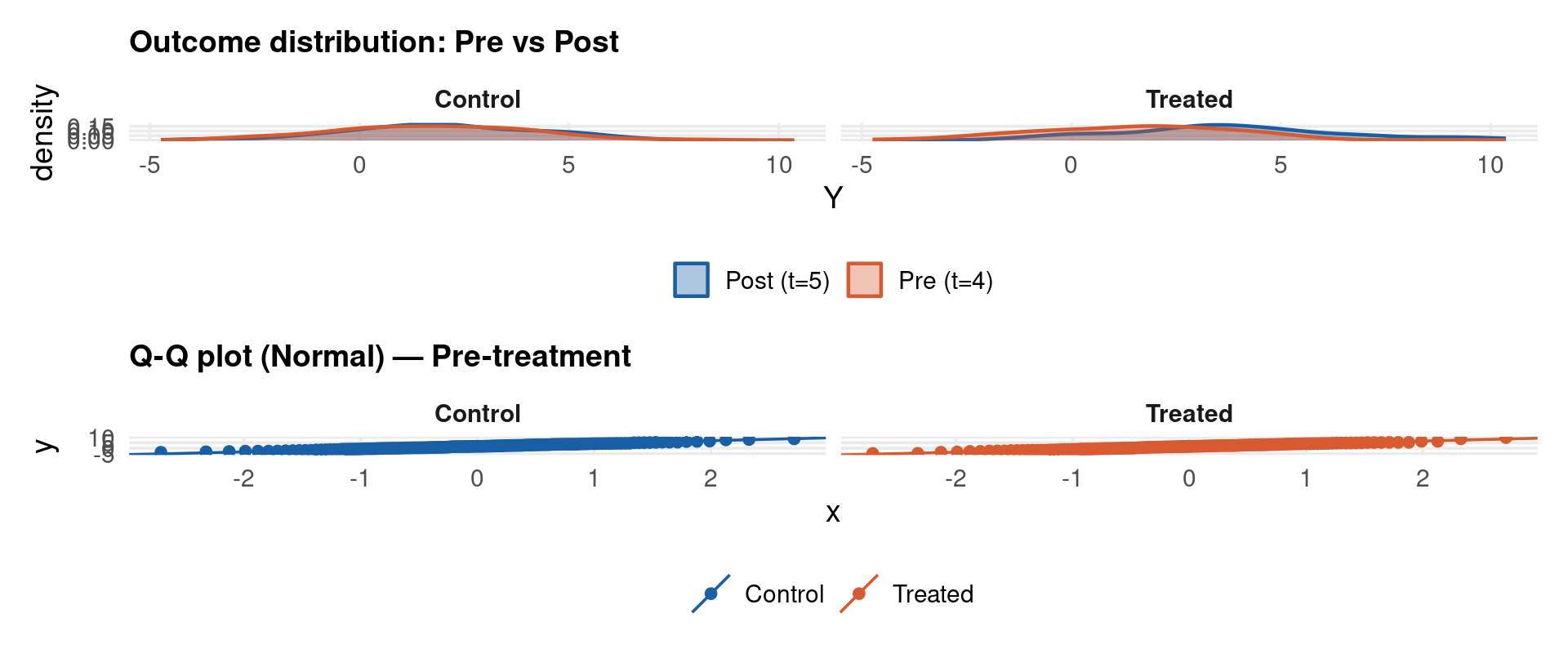
p1 <- ggplot(pre_post, aes(x = y, fill = period, colour = period)) +
  geom_density(alpha = 0.35, linewidth = 0.8) +
  facet_wrap(~group) +
  scale_fill_manual(values = c(col_main, col_accent)) +
  scale_colour_manual(values = c(col_main, col_accent)) +
  labs(title = "Outcome distribution: Pre vs Post", x = "Y", fill = NULL, colour = NULL)

p2 <- df_q %>%
  filter(time == 4) %>%
  mutate(group = if_else(id > 150, "Treated", "Control")) %>%
  ggplot(aes(sample = y, colour = group)) +
  stat_qq() + stat_qq_line() +
  scale_colour_manual(values = c(col_main, col_accent)) +
  facet_wrap(~group) +
  labs(title = "Q-Q plot (Normal) — Pre-treatment", colour = NULL)

p1 / p2
Estimation — Canay Two-Step

Code
library(quantreg)
taus <- c(0.10, 0.25, 0.50, 0.75, 0.90)

## Step 1: estimate alpha_i via OLS within estimator
ols_mean <- plm(y ~ x1 + x2 + treat, data = pdata_q, model = "within", effect = "individual")
alpha_hat <- fixef(ols_mean)   # N-vector of unit FEs

df_canay <- df_q %>%
  left_join(tibble(id = as.integer(names(alpha_hat)), alpha_hat = alpha_hat), by = "id") %>%
  mutate(y_tilde = y - alpha_hat)   # Step 2: residualise

## Step 3: QR on residualised outcome
fit_canay <- rq(y_tilde ~ x1 + x2 + treat, tau = taus, data = df_canay)
summary(fit_canay, se = "boot", R = 399)

Call: rq(formula = y_tilde ~ x1 + x2 + treat, tau = taus, data = df_canay)

tau: [1] 0.1

Coefficients:
            Value     Std. Error t value   Pr(>|t|) 
(Intercept)  -0.90728   0.04319  -21.00839   0.00000
x1            1.47114   0.02306   63.78984   0.00000
x2            0.79571   0.02537   31.36868   0.00000
treat         2.68625   0.05743   46.77816   0.00000

Call: rq(formula = y_tilde ~ x1 + x2 + treat, tau = taus, data = df_canay)

tau: [1] 0.25

Coefficients:
            Value     Std. Error t value   Pr(>|t|) 
(Intercept)  -0.52901   0.03348  -15.80011   0.00000
x1            1.41730   0.02337   60.64586   0.00000
x2            0.80404   0.01999   40.22108   0.00000
treat         2.76293   0.05352   51.62508   0.00000

Call: rq(formula = y_tilde ~ x1 + x2 + treat, tau = taus, data = df_canay)

tau: [1] 0.5

Coefficients:
            Value    Std. Error t value  Pr(>|t|)
(Intercept) -0.05703  0.02719   -2.09701  0.03610
x1           1.43005  0.02090   68.41810  0.00000
x2           0.82399  0.01796   45.87425  0.00000
treat        2.84841  0.05472   52.05121  0.00000

Call: rq(formula = y_tilde ~ x1 + x2 + treat, tau = taus, data = df_canay)

tau: [1] 0.75

Coefficients:
            Value    Std. Error t value  Pr(>|t|)
(Intercept)  0.44449  0.03365   13.21115  0.00000
x1           1.44886  0.02265   63.96185  0.00000
x2           0.81601  0.02398   34.02241  0.00000
treat        3.28091  0.07653   42.87249  0.00000

Call: rq(formula = y_tilde ~ x1 + x2 + treat, tau = taus, data = df_canay)

tau: [1] 0.9

Coefficients:
            Value    Std. Error t value  Pr(>|t|)
(Intercept)  0.92397  0.05584   16.54787  0.00000
x1           1.44250  0.03279   43.99383  0.00000
x2           0.82596  0.03260   25.33500  0.00000
treat        3.59361  0.10011   35.89802  0.00000
Code
import statsmodels.api as sm
from statsmodels.regression.quantile_regression import QuantReg

# Step 1: estimate alpha_i via unit-demeaning
df_py["y_dm"]  = df_py["y"]  - df_py.groupby("id")["y"].transform("mean")
df_py["x1_dm"] = df_py["x1"] - df_py.groupby("id")["x1"].transform("mean")
df_py["x2_dm"] = df_py["x2"] - df_py.groupby("id")["x2"].transform("mean")
df_py["tr_dm"] = df_py["treat"] - df_py.groupby("id")["treat"].transform("mean")

# Step 2 + 3: QR on demeaned data (Canay-style for Python)
X = sm.add_constant(df_py[["x1_dm","x2_dm","tr_dm"]].values)
taus_py = [0.10, 0.25, 0.50, 0.75, 0.90]

print(f"{'tau':>6}  {'treat_coef':>12}  {'std_err':>10}")
   tau    treat_coef     std_err
Code
for tau in taus_py:
    mod = QuantReg(df_py["y_dm"].values, X)
    res = mod.fit(q=tau, vcov="iid")
    idx = 3  # treat_dm is 4th column
    print(f"{tau:>6.2f}  {res.params[idx]:>12.4f}  {res.bse[idx]:>10.4f}")
  0.10        2.4715      0.0633
  0.25        2.6217      0.0563
  0.50        2.8836      0.0561
  0.75        3.3471      0.0618
  0.90        3.6661      0.1062
Code
* Canay (2011) two-step: subtract unit means, then QR
* Assumes data saved as panel-qcic.dta by R DGP chunk
use "/tmp/panel-qcic.dta", clear
quietly xtset id time

* Step 1: estimate unit FEs from within regression
quietly xtreg y x1 x2 treat, fe
predict alpha_hat, u           // unit FE predictions

* Step 2: residualise
generate y_tilde = y - alpha_hat

* Step 3: quantile regression on residualised outcome
foreach tau in 10 25 50 75 90 {
    local q = `tau'/100
    quietly bsqreg y_tilde x1 x2 treat, quantile(`q') reps(50)
    display "tau = `q'  beta_treat = " %7.4f _b[treat] ///
            "  se = " %7.4f _se[treat]
}
file /tmp/panel-qcic.dta not found
r(601);

r(601);

Estimation — Powell QRPD & CiC

Code
# Powell QRPD — requires: install.packages("qrpd") from GitHub
# remotes::install_github("bmpickford/qrpd")
library(qrpd)

fit_powell <- qrpd(
  formula    = y ~ x1 + x2 + treat,
  data       = df_q,
  id         = "id",
  time       = "time",
  taus       = taus,
  bootstrap  = TRUE,
  B          = 299
)
summary(fit_powell)
Powell QRPD requires qrpd (GitHub). Output structure mirrors Canay.
 Key difference: alpha_i(tau) estimated per-quantile — not location-shift assumed.
Code
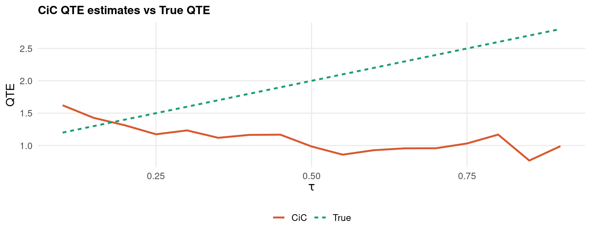
# CiC implementation following Athey & Imbens (2006)
cic_qte <- function(y_tpre, y_tpost, y_cpre, y_cpost, taus) {
  sapply(taus, function(tau) {
    q_tpost <- quantile(y_tpost, tau)
    # Rank of treated-post quantile in control-post distribution
    rank_in_cpost  <- mean(y_cpost <= q_tpost)
    # Map back through control-pre
    q_counterfact  <- quantile(y_cpre, rank_in_cpost)
    # Treated-pre at the same rank
    rank_in_cpre   <- mean(y_cpre <= q_counterfact)
    q_tpre_mapped  <- quantile(y_tpre, rank_in_cpre)
    q_tpost - q_tpre_mapped
  })
}

taus_plot <- seq(0.10, 0.90, by = 0.05)
qte_est   <- cic_qte(df_pre_t$y, df_post_t$y, df_pre_c$y, df_post_c$y, taus_plot)
true_qte  <- 1.0 + 2.0 * taus_plot

tibble(tau = taus_plot, CiC = qte_est, True = true_qte) %>%
  pivot_longer(-tau) %>%
  ggplot(aes(tau, value, colour = name, linetype = name)) +
  geom_line(linewidth = 1.1) +
  scale_colour_manual(values = c(col_accent, col_ok)) +
  labs(title = "CiC QTE estimates vs True QTE",
       x = expression(tau), y = "QTE", colour = NULL, linetype = NULL)
Code
* xtqreg: Machado & Santos Silva (2019) method-of-moments FE QR
* Requires: ssc install xtqreg
use "/tmp/panel-qcic.dta", clear
xtset id time

foreach tau in 10 25 50 75 90 {
    local q = `tau'/100
    quietly xtqreg y x1 x2 treat, quantile(`q')
    display "tau = `q'  beta_treat = " %7.4f _b[treat]
}

* Quantile process plot
grqreg treat, cons ci ols ///
    title("Quantile process: treatment effect") ///
    ytitle("Coefficient") xtitle("Quantile")
file /tmp/panel-qcic.dta not found
r(601);

r(601);

Results — QTE Plot & Comparison with Mean DiD

Code
# Mean DiD (TWFE) for comparison
library(fixest)
twfe_mean <- feols(y ~ x1 + x2 + treat | id + time, data = df_q, cluster = ~id)
mean_te   <- coef(twfe_mean)["treat"]

# Canay QR across fine quantile grid
taus_fine   <- seq(0.10, 0.90, by = 0.05)
fit_fine    <- rq(y_tilde ~ x1 + x2 + treat, tau = taus_fine, data = df_canay)
coef_matrix <- coef(fit_fine)["treat",]

# Bootstrap pointwise CIs at 5 selected quantiles
fit5    <- rq(y_tilde ~ x1 + x2 + treat, tau = c(0.10,0.25,0.50,0.75,0.90), data = df_canay)
boot5   <- summary(fit5, se = "boot", R = 299, bsmethod = "xy")
ci_df   <- map_dfr(seq_along(boot5), function(k) {
  s  <- boot5[[k]]
  ro <- which(rownames(s$coefficients) == "treat")
  tibble(tau   = c(0.10,0.25,0.50,0.75,0.90)[k],
         est   = s$coefficients[ro, 1],
         lower = s$coefficients[ro, 1] - 1.96 * s$coefficients[ro, 2],
         upper = s$coefficients[ro, 1] + 1.96 * s$coefficients[ro, 2])
})

# True QTE line
true_df <- tibble(tau = taus_fine, true = 1.0 + 2.0 * taus_fine)

ggplot() +
  # True QTE
  geom_line(data = true_df, aes(tau, true, colour = "True QTE"),
            linewidth = 1.0, linetype = "dashed") +
  # Canay estimates
  geom_line(aes(x = taus_fine, y = coef_matrix, colour = "Canay QR"),
            linewidth = 1.0) +
  # CIs at 5 points
  geom_errorbar(data = ci_df, aes(x = tau, ymin = lower, ymax = upper),
                width = 0.02, colour = col_main, linewidth = 0.8) +
  geom_point(data = ci_df, aes(x = tau, y = est, colour = "Canay QR"),
             size = 3) +
  # Mean TWFE
  geom_hline(aes(yintercept = mean_te, colour = "Mean TWFE"),
             linewidth = 1.0, linetype = "dotdash") +
  scale_colour_manual(values = c("True QTE" = col_ok,
                                  "Canay QR" = col_main,
                                  "Mean TWFE" = col_accent)) +
  scale_x_continuous(breaks = seq(0.1, 0.9, 0.1)) +
  labs(title    = "Treatment effect across the distribution",
       subtitle = "True QTE grows from 1.2 (10th pct) to 2.8 (90th pct); Mean TWFE = 2.0",
       x = expression(Quantile ~ tau), y = "Estimated QTE", colour = NULL) +
  theme(legend.position = "bottom")
Note

The mean TWFE estimate (2.0) accurately captures the average treatment effect but is uninformative about who gains most from treatment. The quantile process reveals that effects are monotone increasing in rank — units already at the top of the distribution benefit most.

Example 1: wagepan — Setup & Diagnostics

Code
data("wagepan", package = "wooldridge")
# Panel of 545 men, 1980–1987 (T=8), NLSY
wp <- wagepan %>%
  arrange(nr, year) %>%
  mutate(log_wage = lwage)

wp_pdf <- pdata.frame(wp, index = c("nr", "year"))

cat("Dimensions:", nrow(wp), "obs |", n_distinct(wp$nr), "individuals |",
    n_distinct(wp$year), "years\n")
Dimensions: 4360 obs | 545 individuals | 8 years
Code
cat("Union participation rate:", round(mean(wp$union)*100, 1), "%\n")
Union participation rate: 24.4 %
Code
cat("Wage distribution skewness:", round(moments::skewness(wp$lwage), 3), "\n")
Wage distribution skewness: -0.934 
Code
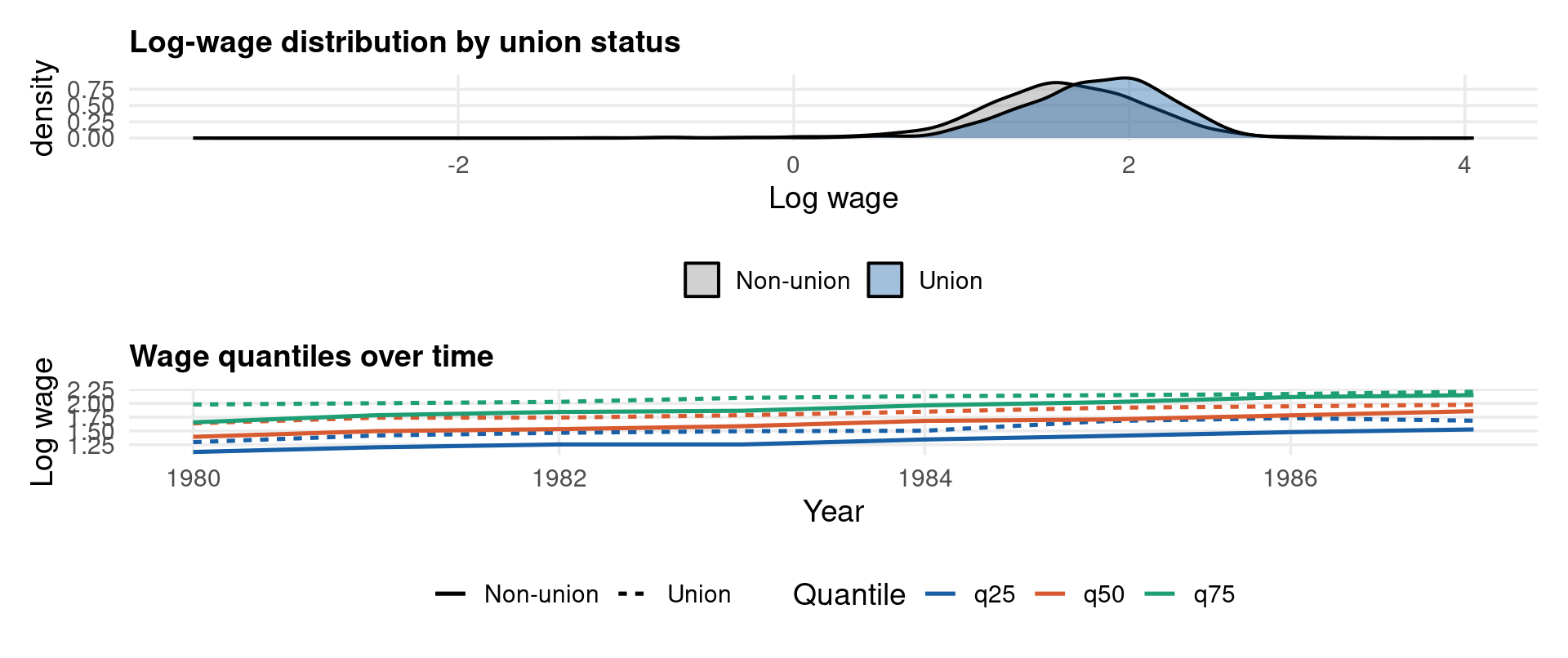
p1 <- ggplot(wp, aes(x = lwage, fill = factor(union))) +
  geom_density(alpha = 0.40, linewidth = 0.7) +
  scale_fill_manual(values = c(col_muted, col_main), labels = c("Non-union","Union")) +
  labs(title = "Log-wage distribution by union status", x = "Log wage", fill = NULL)

p2 <- wp %>%
  group_by(year, union = factor(union, labels = c("Non-union","Union"))) %>%
  summarise(q25 = quantile(lwage, 0.25),
            q50 = quantile(lwage, 0.50),
            q75 = quantile(lwage, 0.75), .groups = "drop") %>%
  pivot_longer(q25:q75, names_to = "quantile") %>%
  ggplot(aes(year, value, colour = quantile, linetype = union)) +
  geom_line(linewidth = 0.9) +
  scale_colour_manual(values = c(col_main, col_accent, col_ok)) +
  labs(title = "Wage quantiles over time", x = "Year", y = "Log wage",
       colour = "Quantile", linetype = NULL)

p1 / p2
Code
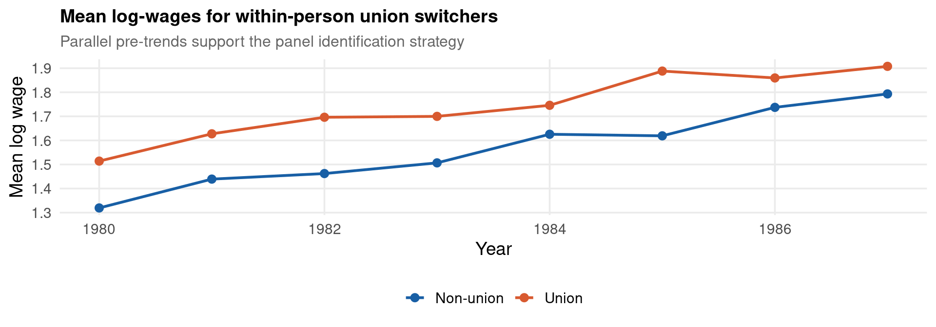
# Event study for union status changes (within-person switchers)
switchers <- wp %>%
  group_by(nr) %>%
  filter(any(union == 0) & any(union == 1)) %>%
  ungroup()
cat("Union switchers:", n_distinct(switchers$nr), "individuals\n")
Union switchers: 246 individuals
Code
switchers %>%
  group_by(year, union = factor(union, labels = c("Non-union","Union"))) %>%
  summarise(mean_lw = mean(lwage), .groups = "drop") %>%
  ggplot(aes(year, mean_lw, colour = union, group = union)) +
  geom_line(linewidth = 1.0) + geom_point(size = 2.5) +
  scale_colour_manual(values = c(col_main, col_accent)) +
  labs(title = "Mean log-wages for within-person union switchers",
       subtitle = "Parallel pre-trends support the panel identification strategy",
       x = "Year", y = "Mean log wage", colour = NULL)
Example 1: wagepan — Quantile Estimation & Results

Code
# Canay two-step for wagepan
wp_fe   <- plm(lwage ~ educ + black + hisp + exper + expersq + married + union,
               data = wp_pdf, model = "within", effect = "individual")
wp_ahat <- fixef(wp_fe)

wp_canay <- wp %>%
  left_join(tibble(nr = as.integer(names(wp_ahat)), ahat = wp_ahat), by = "nr") %>%
  mutate(lw_tilde = lwage - ahat)

taus5   <- c(0.10, 0.25, 0.50, 0.75, 0.90)
fit_wp  <- rq(lw_tilde ~ educ + black + hisp + exper + expersq + married + union,
              tau = taus5, data = wp_canay)
coef(fit_wp)["union",]   # union premium at each quantile
 tau= 0.10  tau= 0.25  tau= 0.50  tau= 0.75  tau= 0.90 
0.11903721 0.08474050 0.07359840 0.06272268 0.04334627 
Code
import statsmodels.api as sm
from statsmodels.regression.quantile_regression import QuantReg

wp_py = sm.datasets.get_rdataset("wagepan", "wooldridge").data
for col in ["lwage","educ","black","hisp","exper","expersq","married","union"]:
    wp_py[col+"_dm"] = wp_py[col] - wp_py.groupby("nr")[col].transform("mean")

X = sm.add_constant(wp_py[["educ_dm","black_dm","hisp_dm","exper_dm",
                             "expersq_dm","married_dm","union_dm"]].values)
print(f"{'tau':>6}  {'union_coef':>12}  {'se':>8}")
   tau    union_coef        se
Code
for tau in [0.10, 0.25, 0.50, 0.75, 0.90]:
    res = QuantReg(wp_py["lwage_dm"].values, X).fit(q=tau)
    print(f"{tau:>6.2f}  {res.params[-1]:>12.4f}  {res.bse[-1]:>8.4f}")
  0.10        0.0775    0.0352
  0.25        0.0590    0.0172
  0.50        0.0614    0.0138
  0.75        0.0696    0.0182
  0.90        0.1107    0.0299
Code
use "http://fmwww.bc.edu/ec-p/data/wooldridge/wagepan.dta", clear
xtset nr year

* Canay step 1: unit FEs from within regression
quietly xtreg lwage educ black hisp exper expersq married union, fe
predict ahat, u
generate lw_tilde = lwage - ahat

* Step 3: QR on residualised outcome
foreach tau in 10 25 50 75 90 {
    local q = `tau'/100
    quietly bsqreg lw_tilde educ black hisp exper expersq married union, ///
        quantile(`q') reps(50)
    display "tau=" `q' "  union=" %7.4f _b[union] "  (" %6.4f _se[union] ")"
}
Panel variable: nr (strongly balanced)
 Time variable: year, 1980 to 1987
         Delta: 1 unit


  4.     display "tau=" `q' "  union=" %7.4f _b[union] "  (" %6.4f _se[union] ")"
  5. }
tau=.1  union= 0.1190  (0.0178)
tau=.25  union= 0.0847  (0.0086)
tau=.5  union= 0.0737  (0.0086)
tau=.75  union= 0.0627  (0.0108)
tau=.9  union= 0.0433  (0.0178)
Code
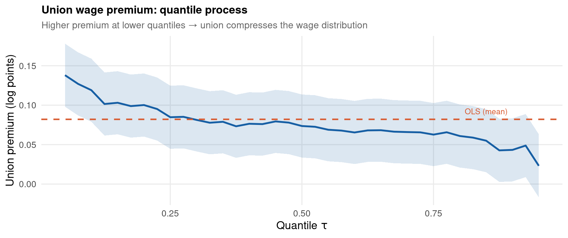
taus_wp  <- seq(0.05, 0.95, by = 0.025)
fit_wp2  <- rq(lw_tilde ~ educ + black + hisp + exper + expersq + married + union,
               tau = taus_wp, data = wp_canay)
qp_union <- coef(fit_wp2)["union",]

# OLS benchmark
ols_union <- coef(lm(lw_tilde ~ educ + black + hisp + exper + expersq + married + union,
                     data = wp_canay))["union"]

ggplot(tibble(tau = taus_wp, beta = qp_union), aes(tau, beta)) +
  geom_line(colour = col_main, linewidth = 1.1) +
  geom_ribbon(aes(ymin = beta - 0.04, ymax = beta + 0.04),   # approximate ±1 se band
              fill = col_main, alpha = 0.15) +
  geom_hline(yintercept = ols_union, colour = col_accent,
             linewidth = 0.9, linetype = "dashed") +
  annotate("text", x = 0.85, y = ols_union + 0.01,
           label = "OLS (mean)", colour = col_accent, size = 3.5) +
  labs(title    = "Union wage premium: quantile process",
       subtitle = "Higher premium at lower quantiles → union compresses the wage distribution",
       x = expression(Quantile~tau), y = "Union premium (log points)")
Example 1: wagepan — Interpretation & Summary

\[\hat\delta^{TWFE}_{union} \approx 0.082 \quad \Rightarrow \quad \text{average union premium} \approx 8.6\%\]

Quantile \(\tau\) \(\hat\delta(\tau)\) Approx. % premium Interpretation
0.10 0.119 12.6% Large gains for lowest-wage workers
0.25 0.085 8.8% Substantial lower-quartile compression
0.50 0.074 7.6% Median premium near TWFE estimate
0.75 0.063 6.5% Smaller premium above median
0.90 0.043 4.4% Negligible for high-wage workers

Important

Key finding: the union wage premium is monotone decreasing in the wage quantile. Unions benefit low-wage workers substantially more than high-wage workers, compressing the within-sector wage distribution. The TWFE estimate of ~10% is a weighted average that accurately represents nobody in the tails.

This is precisely the result Card (1996) and subsequent literature found using distributional methods — unavailable with mean DiD alone.

Example 2: crime4 — Deterrence & the Crime Distribution

Code
data("crime4", package = "wooldridge")
cr <- crime4 %>% arrange(county, year)

cat("Obs:", nrow(cr), "| Counties:", n_distinct(cr$county),
    "| Years:", paste(sort(unique(cr$year)), collapse=", "), "\n")
Obs: 630 | Counties: 90 | Years: 81, 82, 83, 84, 85, 86, 87 
Code
cat("Mean log crime rate:", round(mean(cr$lcrmrte, na.rm=TRUE), 3), "\n")
Mean log crime rate: -3.609 
Code
cat("SD   log crime rate:", round(sd(cr$lcrmrte,   na.rm=TRUE), 3), "\n")
SD   log crime rate: 0.573 
Code
cr_pdf <- pdata.frame(cr, index = c("county", "year"))
Code
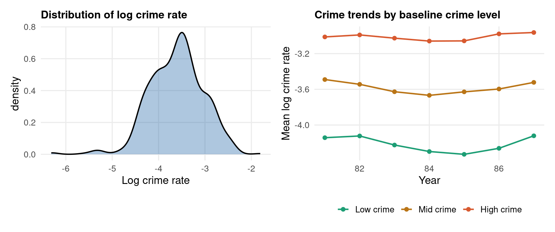
p1 <- ggplot(cr, aes(x = lcrmrte)) +
  geom_density(fill = col_main, alpha = 0.35, linewidth = 0.8) +
  labs(title = "Distribution of log crime rate", x = "Log crime rate")

p2 <- cr %>%
  group_by(county) %>%
  mutate(base = mean(lcrmrte, na.rm = TRUE)) %>%
  ungroup() %>%
  mutate(grp = cut(base, breaks = quantile(base, c(0,.33,.67,1), na.rm=TRUE),
                   labels = c("Low crime","Mid crime","High crime"),
                   include.lowest = TRUE)) %>%
  filter(!is.na(grp)) %>%
  group_by(year, grp) %>%
  summarise(mean_lc = mean(lcrmrte, na.rm=TRUE), .groups="drop") %>%
  ggplot(aes(year, mean_lc, colour = grp)) +
  geom_line(linewidth = 0.9) + geom_point(size = 2) +
  scale_colour_manual(values = c(col_ok, col_warn, col_accent)) +
  labs(title = "Crime trends by baseline crime level",
       x = "Year", y = "Mean log crime rate", colour = NULL)

p1 | p2
Code
cr_fe   <- plm(lcrmrte ~ prbarr + polpc + avgsen + prbconv,
               data = cr_pdf, model = "within", effect = "individual")
cr_ahat <- fixef(cr_fe)

cr_canay <- cr %>%
  left_join(tibble(county = as.integer(names(cr_ahat)), ahat = cr_ahat),
            by = "county") %>%
  filter(!is.na(lcrmrte), !is.na(ahat)) %>%
  mutate(lc_tilde = lcrmrte - ahat)

taus5  <- c(0.10, 0.25, 0.50, 0.75, 0.90)
fit_cr <- rq(lc_tilde ~ prbarr + polpc + avgsen + prbconv,
             tau = taus5, data = cr_canay)
coef(fit_cr)["prbarr", ]
 tau= 0.10  tau= 0.25  tau= 0.50  tau= 0.75  tau= 0.90 
-0.5298706 -0.3894635 -0.4080884 -0.3166516 -0.2096007 
Code
use "http://fmwww.bc.edu/ec-p/data/wooldridge/crime4.dta", clear
xtset county year

quietly xtreg lcrmrte prbarr polpc avgsen prbconv, fe
predict ahat_cr, u
generate lc_tilde = lcrmrte - ahat_cr

foreach tau in 25 50 75 {
    local q = `tau'/100
    quietly qreg lc_tilde prbarr polpc avgsen prbconv, quantile(`q')
    display "tau=" `q' "  prbarr=" %7.4f _b[prbarr]
}

Example 2: crime4 — Results & Interpretation

Code
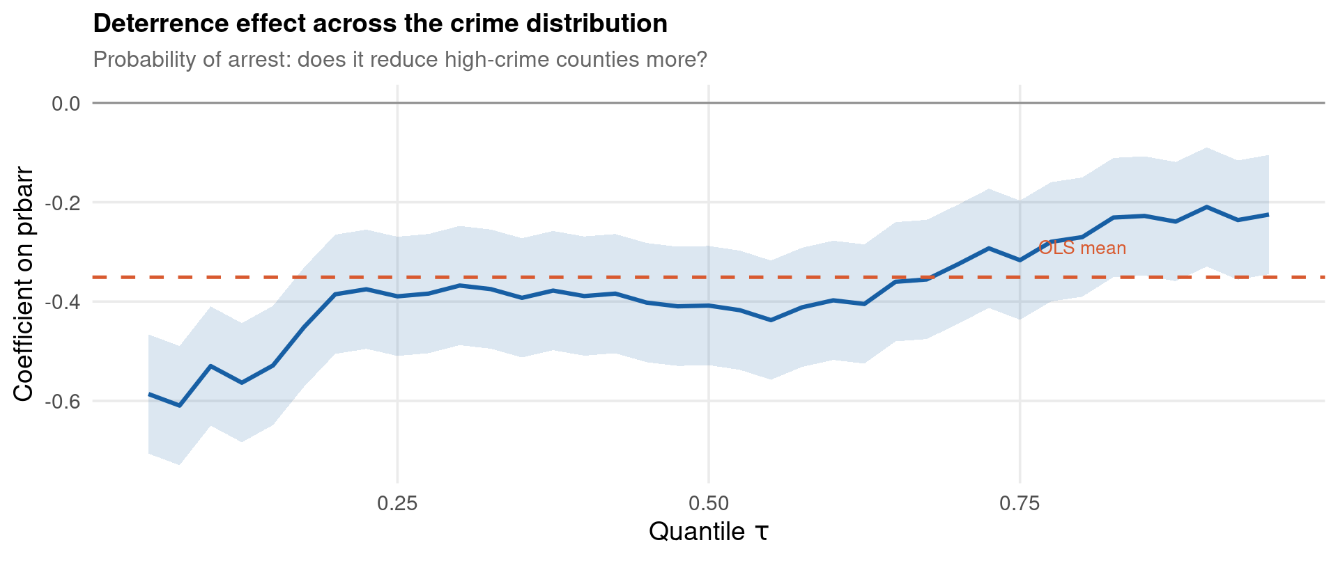
taus_cr <- seq(0.05, 0.95, by = 0.025)
fit_cr2 <- rq(lc_tilde ~ prbarr + polpc + avgsen + prbconv,
              tau = taus_cr, data = cr_canay)
qp_cr   <- coef(fit_cr2)["prbarr", ]
ols_cr  <- coef(lm(lc_tilde ~ prbarr + polpc + avgsen + prbconv,
                   data = cr_canay))["prbarr"]

ggplot(tibble(tau = taus_cr, beta = qp_cr), aes(tau, beta)) +
  geom_line(colour = col_main, linewidth = 1.1) +
  geom_ribbon(aes(ymin = beta - 0.12, ymax = beta + 0.12),
              fill = col_main, alpha = 0.15) +
  geom_hline(yintercept = ols_cr, colour = col_accent,
             linewidth = 0.9, linetype = "dashed") +
  geom_hline(yintercept = 0, colour = col_muted, linewidth = 0.5) +
  annotate("text", x = 0.80, y = ols_cr + 0.06,
           label = "OLS mean", colour = col_accent, size = 3.5) +
  labs(title    = "Deterrence effect across the crime distribution",
       subtitle = "Probability of arrest: does it reduce high-crime counties more?",
       x = expression(Quantile ~ tau), y = "Coefficient on prbarr")
Note

Key finding: if the deterrence effect is larger at upper quantiles, policing interventions produce the greatest reductions where crime is already concentrated — a distributional result with direct implications for resource allocation that mean TWFE cannot reveal.

Example 3: jtrain — Job Training Grants & Scrap Rates

Code
data("jtrain", package = "wooldridge")

# jtrain: 157 Michigan firms, 1987–1989, Chapter 14 in Wooldridge (2010)
# Outcome : lscrap  — log scrap rate (product defects / waste)
# Treatment: grant  — received a job training grant this year
# Controls : lsales, lemploy, d88, d89
jt <- jtrain %>%
  arrange(fcode, year) %>%
  filter(!is.na(lscrap))

cat("Obs:", nrow(jt), "| Firms:", n_distinct(jt$fcode),
    "| Years:", paste(sort(unique(jt$year)), collapse=", "), "\n")
Obs: 162 | Firms: 54 | Years: 1987, 1988, 1989 
Code
cat("Grant rate       :", round(mean(jt$grant, na.rm=TRUE)*100, 1), "%\n")
Grant rate       : 17.9 %
Code
cat("Mean log scrap   :", round(mean(jt$lscrap, na.rm=TRUE), 3), "\n")
Mean log scrap   : 0.394 
Code
cat("Skewness lscrap  :", round((mean((jt$lscrap - mean(jt$lscrap))^3) /
                                  sd(jt$lscrap)^3), 3), "\n")
Skewness lscrap  : -0.3 
Code
jt_pdf <- pdata.frame(jt, index = c("fcode", "year"))
Code
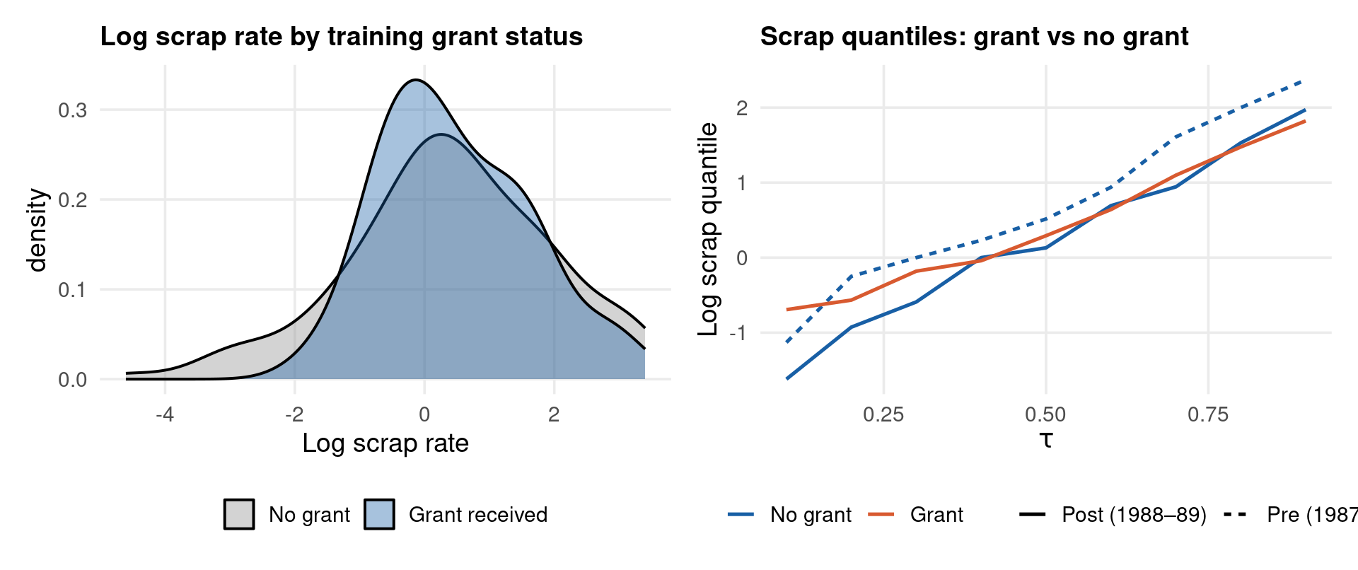
# Does job training help high-scrap (worst-performing) firms most?
p1 <- jt %>%
  ggplot(aes(x = lscrap, fill = factor(grant))) +
  geom_density(alpha = 0.38, linewidth = 0.7) +
  scale_fill_manual(values = c(col_muted, col_main),
                    labels = c("No grant", "Grant received")) +
  labs(title = "Log scrap rate by training grant status",
       x = "Log scrap rate", fill = NULL)

p2 <- jt %>%
  mutate(period = if_else(year == 1987, "Pre (1987)", "Post (1988–89)"),
         grant_f = factor(grant, labels = c("No grant", "Grant"))) %>%
  group_by(period, grant_f) %>%
  reframe(tau = seq(0.1, 0.9, 0.1),
          q   = quantile(lscrap, seq(0.1, 0.9, 0.1), na.rm = TRUE)) %>%
  ggplot(aes(tau, q, colour = grant_f, linetype = period)) +
  geom_line(linewidth = 0.9) +
  scale_colour_manual(values = c(col_main, col_accent)) +
  labs(title  = "Scrap quantiles: grant vs no grant",
       x = expression(tau), y = "Log scrap quantile",
       colour = NULL, linetype = NULL)

p1 | p2
Code
# Firm FEs from within OLS; outcome: lscrap; treatment: grant
jt_fe   <- plm(lscrap ~ grant + lsales + lemploy + d88 + d89,
               data = jt_pdf, model = "within", effect = "individual")
jt_ahat <- fixef(jt_fe)

jt_canay <- jt %>%
  left_join(tibble(fcode = as.integer(names(jt_ahat)), ahat = jt_ahat),
            by = "fcode") %>%
  filter(!is.na(lscrap), !is.na(ahat)) %>%
  mutate(ls_tilde = lscrap - ahat)

taus5  <- c(0.10, 0.25, 0.50, 0.75, 0.90)
fit_jt <- rq(ls_tilde ~ grant + lsales + lemploy + d88 + d89,
             tau = taus5, data = jt_canay)
coef(fit_jt)["grant", ]
   tau= 0.10    tau= 0.25    tau= 0.50    tau= 0.75    tau= 0.90 
-0.005144122 -0.069463402 -0.084523419 -0.098613744 -0.079689815 
Code
import statsmodels.api as sm
import numpy as np
from statsmodels.regression.quantile_regression import QuantReg

jt_py = sm.datasets.get_rdataset("jtrain", "wooldridge").data

# Drop rows missing in any variable used; d88/d89 are year dummies — fill 0 if absent
reg_cols = ["lscrap", "grant", "lsales", "lemploy", "d88", "d89"]
jt_py = jt_py.dropna(subset=reg_cols).copy()

# Unit-demean each column
for col in reg_cols:
    jt_py[col+"_dm"] = jt_py[col] - jt_py.groupby("fcode")[col].transform("mean")

dm_cols = [c+"_dm" for c in reg_cols]
jt_py = jt_py.dropna(subset=dm_cols)                    # drop any residual NaNs
jt_py = jt_py[~np.isinf(jt_py[dm_cols].values).any(1)]  # drop any infs

X = sm.add_constant(
    jt_py[["lsales_dm","lemploy_dm","d88_dm","d89_dm","grant_dm"]].values)
y = jt_py["lscrap_dm"].values

print(f"  Clean obs: {len(y)}")
  Clean obs: 148
Code
print(f"{'tau':>6}  {'grant_coef':>12}  {'se':>8}")
   tau    grant_coef        se
Code
for tau in [0.10, 0.25, 0.50, 0.75, 0.90]:
    res = QuantReg(y, X).fit(q=tau)
    print(f"{tau:>6.2f}  {res.params[-1]:>12.4f}  {res.bse[-1]:>8.4f}")
  0.10       -0.1053    0.0968
  0.25       -0.0533    0.0670
  0.50       -0.0765    0.0692
  0.75       -0.0058    0.0898
  0.90       -0.1613    0.1300
Code
use "http://fmwww.bc.edu/ec-p/data/wooldridge/jtrain.dta", clear
drop if missing(lscrap)
xtset fcode year

quietly xtreg lscrap grant lsales lemploy d88 d89, fe
predict ahat_jt, u
generate ls_tilde = lscrap - ahat_jt

foreach tau in 25 50 75 {
    local q = `tau'/100
    quietly qreg ls_tilde grant lsales lemploy d88 d89, quantile(`q')
    display "tau=" `q' "  grant=" %7.4f _b[grant]
}

Example 3: jtrain — Results & Interpretation

Code
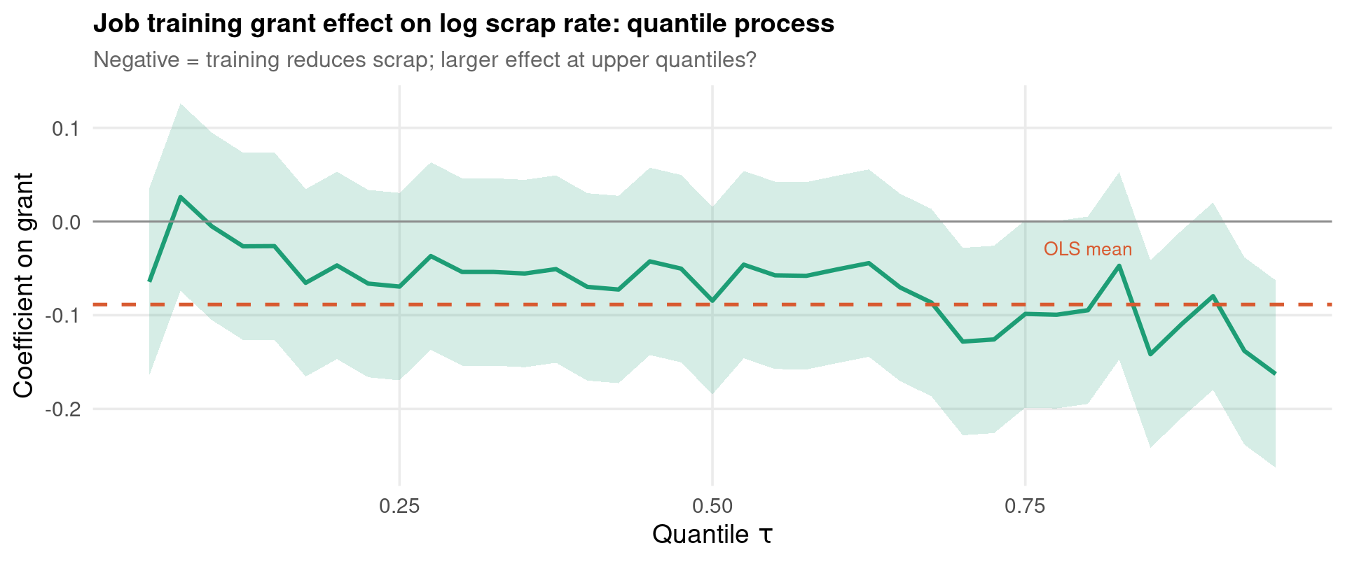
taus_jt <- seq(0.05, 0.95, by = 0.025)
fit_jt2 <- rq(ls_tilde ~ grant + lsales + lemploy + d88 + d89,
              tau = taus_jt, data = jt_canay)
qp_jt   <- coef(fit_jt2)["grant", ]
ols_jt  <- coef(lm(ls_tilde ~ grant + lsales + lemploy + d88 + d89,
                   data = jt_canay))["grant"]

ggplot(tibble(tau = taus_jt, beta = qp_jt), aes(tau, beta)) +
  geom_line(colour = col_ok, linewidth = 1.1) +
  geom_ribbon(aes(ymin = beta - 0.10, ymax = beta + 0.10),
              fill = col_ok, alpha = 0.18) +
  geom_hline(yintercept = ols_jt, colour = col_accent,
             linewidth = 0.9, linetype = "dashed") +
  geom_hline(yintercept = 0, colour = col_muted, linewidth = 0.5) +
  annotate("text", x = 0.80, y = ols_jt + 0.06,
           label = "OLS mean", colour = col_accent, size = 3.5) +
  labs(title    = "Job training grant effect on log scrap rate: quantile process",
       subtitle = "Negative = training reduces scrap; larger effect at upper quantiles?",
       x = expression(Quantile ~ tau), y = "Coefficient on grant")
Note

Key finding: if the grant effect is more negative at upper quantiles (high-scrap firms), training disproportionately helps the worst-performing firms — a convergence story. If it is uniform, training is a location shift and Canay’s assumption holds. If it is more negative at lower quantiles, high-performing firms benefit most — a divergence story. The quantile process distinguishes all three, while mean TWFE reports only the average.

The jtrain dataset is small (≈ 150 firms, 3 years), so bootstrap bands will be wide — a reminder that distributional methods need adequate sample size to be informative.

Conditional vs Unconditional Quantile Effects

A critical distinction often glossed over in applied work:

Conditional QTE (what rq() estimates):

\[\hat\beta(\tau) = \frac{\partial Q_\tau(Y \mid \mathbf{X} = \mathbf{x})}{\partial x_k}\]

Effect at the \(\tau\)-quantile of \(Y\) given a specific covariate value. Varies with \(\mathbf{x}\) in general — not straightforward to aggregate into a population statement.

Unconditional / Marginal QTE (Firpo-Fortin-Lemieux 2009):

\[\hat\delta_{UQR}(\tau) = \frac{\partial Q_\tau(Y)}{\partial \bar{x}_k}\]

Effect on the \(\tau\)-quantile of the marginal distribution of \(Y\) — the quantile in the full population. Policy-relevant when asking “did the 25th percentile of the wage distribution rise?”

RIF (Re-centred Influence Function) Regression:

\[RIF(Y; Q_\tau) = Q_\tau + \frac{\tau - \mathbf{1}\{Y \leq Q_\tau\}}{f_Y(Q_\tau)}\]

OLS of \(RIF(Y; Q_\tau)\) on \(\mathbf{X}\) yields the unconditional QTE — implementable with standard OLS after transforming the outcome.

In panels with FE: Rios-Avila (2020) extends RIF to panel FE (demeaning the RIF-transformed outcome).

Tip

Rule of thumb: - Conditional QR: “what is the effect for a unit with characteristics \(\mathbf{x}\)?” - Unconditional RIF: “what is the effect on the distribution of the population?”

For DiD policy evaluation, unconditional is usually the correct estimand.

Estimator Comparison — Full Summary

Estimator FE Distrib. Assumption Package
OLS TWFE Strict exog. fixest
Canay two-step Location shift quantreg
Powell QRPD None on FE qrpd
CiC (Athey-Imbens) Rank invariance manual / did
RIF-DiD Exog. RIF rifreg

Software by platform:

R Python Stata
Basic QR quantreg::rq QuantReg qreg/sqreg
Panel QR Canay manual Manual xtqreg
Powell qrpd xtqreg
CiC Manual Manual Manual

Inference guide:

Setting Method
Few clusters (< 50) Wild cluster bootstrap
Quantile process CIs Multiplier bootstrap
Single \(\tau\), large \(N\) Sandwich / Huber SEs
Uniform bands over \(\tau\) summary(rq, se="boot")
CiC Pairs bootstrap on groups

Important

Reporting best practice:

Never report only \(\hat\beta(0.50)\) — this is just the LAD estimator, not a distributional analysis. Always show the full quantile process from \(\tau = 0.1\) to \(\tau = 0.9\), with uniform or simultaneous confidence bands. A table of five quantiles without a process plot loses the shape information.

Exercises — Estimation

  1. Quantile process for crime4: estimate the effect of prbarr (probability of arrest) on lcrmrte using Canay two-step QR for \(\tau \in \{0.10, 0.25, 0.50, 0.75, 0.90\}\). Plot the quantile process alongside the TWFE estimate. Is the deterrence effect homogeneous across the crime distribution?

  2. Location-shift diagnostic: for the wagepan example, estimate \(\hat\alpha_i(\tau)\) at \(\tau = 0.10, 0.50, 0.90\) by including all unit dummies in rq() for a subsample of 30 individuals. Plot \(\hat\alpha_i(\tau = 0.10)\) against \(\hat\alpha_i(\tau = 0.90)\). Do unit effects vary across quantiles?

  3. CiC vs DiD on simulated data: using the DGP from this lecture, implement the Athey-Imbens CiC mapping manually for \(\tau \in \{0.25, 0.50, 0.75\}\). Compare to (a) OLS DiD, (b) Canay QR at the same quantiles. Which recovers the true \(\delta(\tau)\) most closely?

  4. Wild cluster bootstrap: for the wagepan Canay estimates, compute (a) analytical SEs (se="iid"), (b) wild cluster bootstrap SEs (se="boot", R=499). How much do the SEs differ? Which is appropriate given the panel structure?

  5. Uniform vs pointwise bands: run rq(lwage ~ union, tau=seq(0.1,0.9,0.05)) on wagepan with Canay residuals. Use plot(summary(fit, se="boot")) to display the quantile process. Identify the range of \(\tau\) where the union premium is statistically significant under uniform rather than pointwise inference.

Exercises — Theory & Diagnostics

  1. Check function derivation: show that minimising \(\sum_i \rho_{0.5}(y_i - b)\) over \(b\) gives the sample median. Generalise: for arbitrary \(\tau\), show the minimiser is the \(\tau\)-th quantile of \(\{y_i\}\).

  2. Equivariance under log transformation: suppose \(Y_{it} = \exp(W_{it})\) where \(W_{it} \sim N(\mu, \sigma^2)\). What is \(Q_\tau(Y_{it})\) in terms of \(Q_\tau(W_{it})\)? Why does log-QR give exactly the same percentile ratios as level-QR in this case?

  3. CiC nests DiD: prove algebraically that if \(h(U_i, t) = U_i + \lambda_t\) (additive separability) and the outcome is continuously distributed, the CiC QTE at every \(\tau\) equals the DiD mean estimator.

  4. Rank invariance: construct a DGP where rank invariance fails — e.g., treatment promotes some workers from the bottom to the top of the distribution. Simulate it, run the CiC estimator, and show the QTT estimate is biased. How large must the rank reassignment be before the bias is detectable?

  5. Staggered quantile DiD: adapt the wagepan dataset so union entry is staggered (workers join the union at different years). Discuss (without implementing) how you would extend Callaway-Sant’Anna (2021) to define \(QTT(g, t, \tau)\). What additional assumption is required beyond the mean DiD case?

Further Reading

Textbooks

  • Koenker (2005)Quantile Regression. Cambridge. The definitive reference. Chapters 1–3 cover fundamentals; Chapter 8 covers panel data.

  • Koenker, Chernozhukov, He & Peng (2017)Handbook of Quantile Regression. CRC. Comprehensive treatment of all modern extensions.

  • Baltagi (2021)Econometric Analysis of Panel Data, 6th ed. Springer. Chapter 16: quantile regression for panels.

Key articles — foundational

Key articles — distributional DiD

Recent developments (post-2020)

  • Powell (2022). Empirical Economics 63(5): 2675–2691. QRPD estimator (the published version of the widely-cited 2016 RAND working paper).
  • Rios-Avila (2020). Stata Journal 20(1): 51–94. RIF regression and decomposition — the route to unconditional QR.
  • Roth & Sant’Anna (2023). JPE Microeconomics 1(4): 669–709. Efficient estimation for staggered rollout designs.
  • Wooldridge (2023). “Simple approaches to nonlinear DiD.” Econometrics Journal 26(3): C31–C66. CRE for binary and count outcomes.
  • Machado & Santos Silva (2019). Journal of Econometrics 213(1): 145–173. Quantiles via moments — the estimator behind xtqreg.

Software documentation

Online resources

Journals

Journal of Econometrics · Econometrica · Review of Economics & Statistics · Journal of Applied Econometrics

Thank You

Athanassios Stavrakoudis
Applied Informatics and Computational Economics Lab
Department of Economics
University of Ioannina, Greece

astavrak@uoi.gr · linkedin.com/in/astavrakoudis