4 Drawing maps of Europe
Libraries used in this chapter.
library(tidyverse)
library(eurostat)
library(leaflet)
library(sf)
library(scales)
library(cowplot)
library(ggthemes)
4.1 A basic map of Europe
Shapefiles containing border polygons of European countries:
Brief explanations:
- resolution, value indicating the map resolution, 10 is a fair choice for accuracy and data size
- nuts_level, the administrative level, 0 is for countries
- year, the reference year, for nuts_level=0 this is not important, for other levels might be.
We can download the shapefiles of EU countries:
And plot them:

This is a first basic approach. In general we have to decide about two things:
- How to include parts of Word outside of European continent
- If we want to include countries that provide data to Eurostat (Norway, Turkey, etc) but do not belong to European Union.
Here, for the sake of simplicity, we will not consider the above. We will exclude parts outside European continent and also non EU countries. First we will construct a dataset containing the shapefiles of 27 EU countries, keeping only the necessary features (geo, name, geometry):
EU28 <- eu_countries %>%
  select(geo = code, name)
EU27 <- eu_countries %>%
  filter(code != 'UK') %>%
select(geo = code, name)SHP_28 <- SHP_0 %>%
select(geo = NUTS_ID, geometry) %>%
inner_join(EU28, by = "geo") %>%
arrange(geo) %>%
st_as_sf()
SHP_27 <- SHP_0 %>%
select(geo = NUTS_ID, geometry) %>%
inner_join(EU27, by = "geo") %>%
arrange(geo) %>%
st_as_sf()Here is how SHP_27 dataset looks like:
## Simple feature collection with 27 features and 2 fields
## Geometry type: MULTIPOLYGON
## Dimension:     XY
## Bounding box:  xmin: -63.08825 ymin: -21.38917 xmax: 55.83616 ymax: 70.0864
## Geodetic CRS:  WGS 84
## First 10 features:
##    geo     name                       geometry
## 1   AT  Austria MULTIPOLYGON (((15.54245 48...
## 2   BE  Belgium MULTIPOLYGON (((5.10218 51....
## 3   BG Bulgaria MULTIPOLYGON (((22.99717 43...
## 4   CY   Cyprus MULTIPOLYGON (((32.27423 35...
## 5   CZ  Czechia MULTIPOLYGON (((14.31787 51...
## 6   DE  Germany MULTIPOLYGON (((8.63593 54....
## 7   DK  Denmark MULTIPOLYGON (((10.19436 56...
## 8   EE  Estonia MULTIPOLYGON (((25.83016 59...
## 9   EL   Greece MULTIPOLYGON (((26.03276 40...
## 10  ES    Spain MULTIPOLYGON (((-7.69974 43...
If we plot it again we see:

We need now to focus on European continent, so we use the scale_ command to crop the graph area:
SHP_27 %>%
  ggplot() +
geom_sf() +
scale_x_continuous(limits = c(-10, 35)) +
scale_y_continuous(limits = c(35, 65))
Limits are be set differently to meet other needs. Here we just to prefer to have a close to square plot, at the expense of truncating a bit the northern parts of Sweden and Finland. It is compromise in order not to loose space for smaller countries. Since we have a basic map, we can now get rid of the coordinate system:
SHP_27 %>%
  ggplot() +
  geom_sf() +
  scale_x_continuous(limits = c(-10, 35)) +
scale_y_continuous(limits = c(35, 65)) +
theme_void()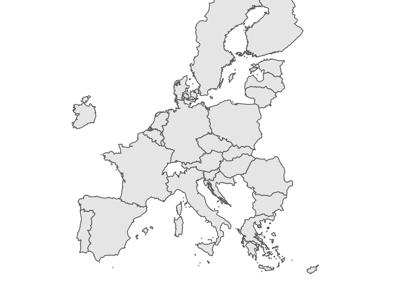 For the moment the map we have is good enough.
Time to fill the countries with colors.
For the moment the map we have is good enough.
Time to fill the countries with colors.
4.2 Constructing a geospatial dataset
Let’s get from eurostat the dataset about internet usage by individuals:
Now we filter the dataset in order to obtain one value per country, for example percentage of individuals who never used internet, as measured during 2020:
## # A tibble: 39 × 5
##    unit        na_item geo    time values
##    <chr>       <chr>   <chr> <dbl>  <dbl>
##  1 CLV_PCH_PRE B1GQ    AT     2020   -6.7
##  2 CLV_PCH_PRE B1GQ    BA     2020   -3.2
##  3 CLV_PCH_PRE B1GQ    BE     2020   -5.7
##  4 CLV_PCH_PRE B1GQ    BG     2020   -4.4
##  5 CLV_PCH_PRE B1GQ    CH     2020   -2.4
##  6 CLV_PCH_PRE B1GQ    CY     2020   -5.2
##  7 CLV_PCH_PRE B1GQ    CZ     2020   -5.8
##  8 CLV_PCH_PRE B1GQ    DE     2020   -4.6
##  9 CLV_PCH_PRE B1GQ    DK     2020   -2.1
## 10 CLV_PCH_PRE B1GQ    EA     2020   -6.4
## # … with 29 more rows
If we keep only the geo and values columns and join with the SHP_27 shapefile we get a geospatial dataset:
tec00115_shp <- tec00115 %>%
  filter(unit == 'CLV_PCH_PRE') %>%
  filter(time == 2020) %>%
  select(geo, values) %>%
  inner_join(SHP_27, by = "geo") %>%
  st_as_sf()
Thus we can now plot the map of EU countries filled with a color corresponding to values:
tec00115_shp %>%
  ggplot(aes(fill = values)) +
  geom_sf() +
  scale_x_continuous(limits = c(-10, 35)) +
  scale_y_continuous(limits = c(35, 65)) +
  theme_void()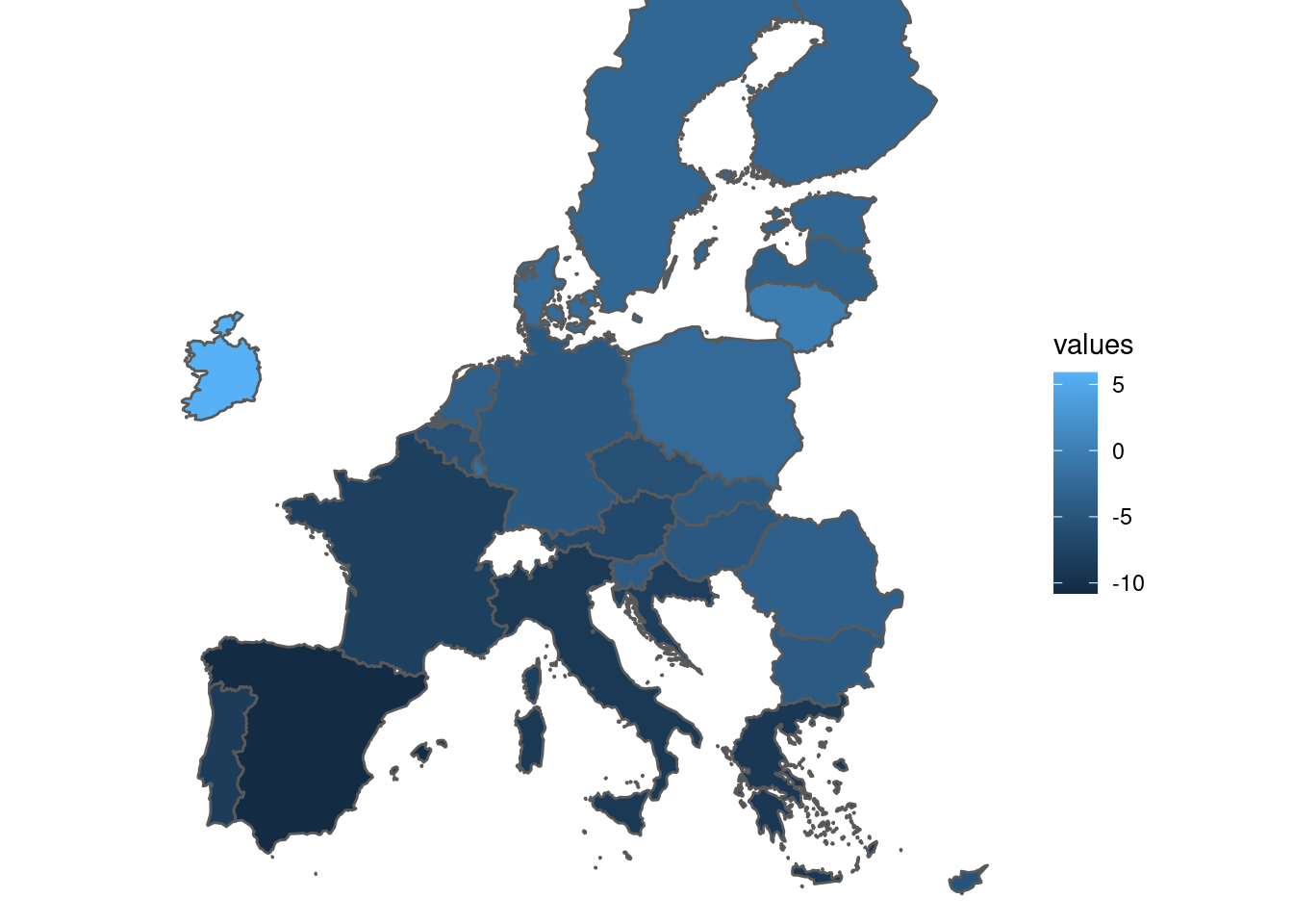
When plotting a continuous variable ggplot uses scale_fill_continuous by default. It accepts two color palettes, default and viridis, for example:
tec00115_shp %>%
  ggplot(aes(fill = values)) +
  geom_sf() +
  scale_fill_continuous(type = "viridis") +
  scale_x_continuous(limits = c(-10, 35)) +
  scale_y_continuous(limits = c(35, 65)) +
  theme_void()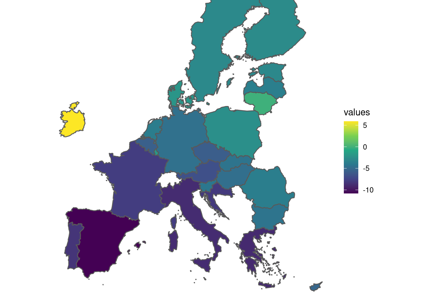
4.2.1 viridis scale for continuous data
The same result as above can be obtained with scale_fill_viridis_c function:
tec00115_shp %>%
  ggplot(aes(fill = values)) +
  geom_sf() +
  scale_fill_viridis_c() +
  scale_x_continuous(limits = c(-10, 35)) +
  scale_y_continuous(limits = c(35, 65)) +
  theme_void()
viridis scale color can be adapted. Several color schemes can be used, such as viridis, magma, plasma, inferno, civids, mako, and rocket. For example:
tec00115_shp %>%
  ggplot(aes(fill = values)) +
  geom_sf() +
  scale_fill_viridis_c(option = "plasma") +
  scale_x_continuous(limits = c(-10, 35)) +
  scale_y_continuous(limits = c(35, 65)) +
  theme_void()
Also, transparency can be set with alpha, for example:
tec00115_shp %>%
  ggplot(aes(fill = values)) +
  geom_sf() +
  scale_fill_viridis_c(
    option = "plasma",
    alpha = 0.5
  ) +
  scale_x_continuous(limits = c(-10, 35)) +
  scale_y_continuous(limits = c(35, 65)) +
  theme_void()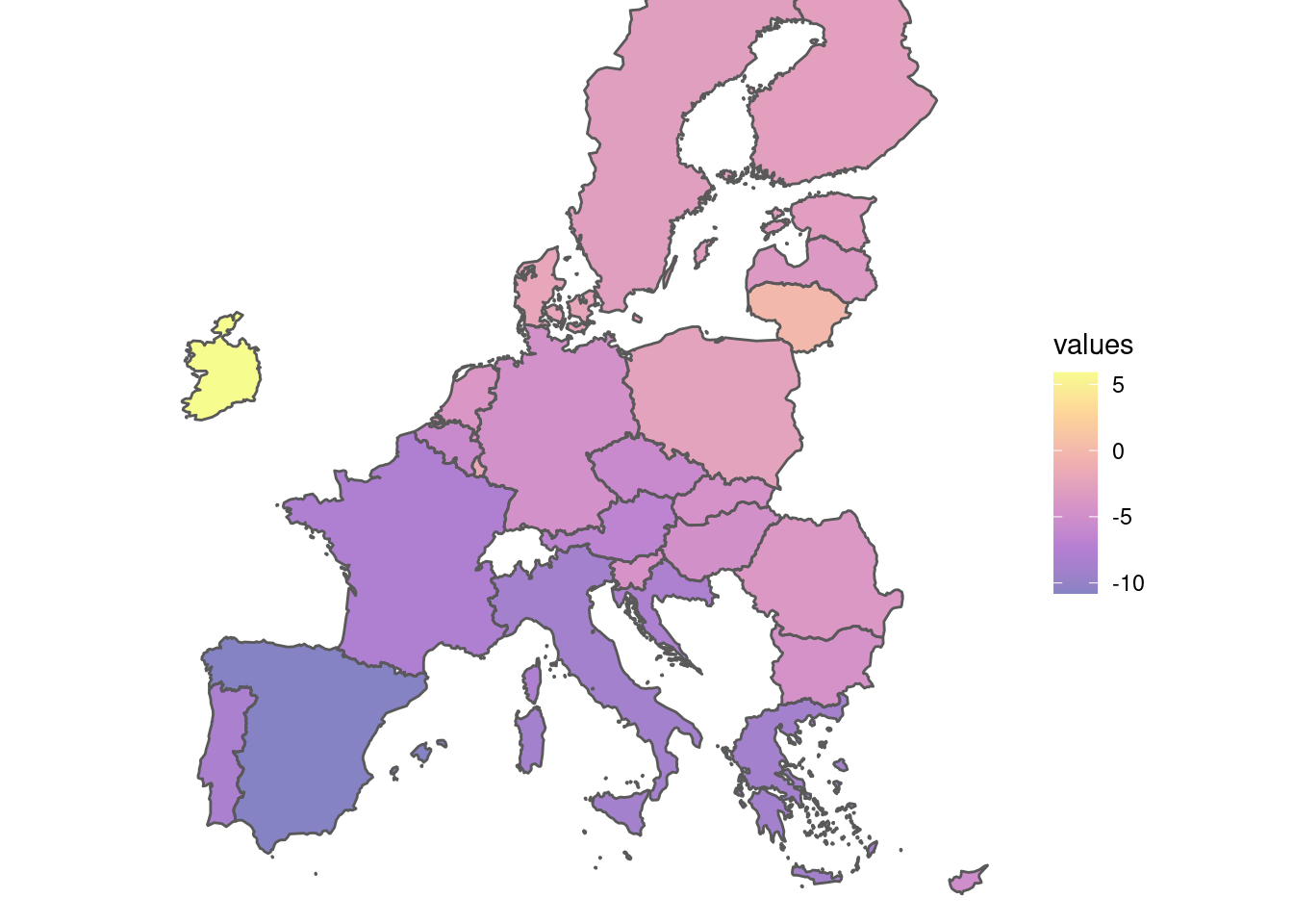
4.3 Style of the plot theme
4.3.1 Styling the legend of a map
Default placing of the legend is at the right of the plot, outside of the plot area. This if fine as a starting point. Let us now see how we modify the style of the legend. We will use the function guide_colorbar to modify its appearance:
tec00115_shp %>%
  ggplot(aes(fill = values)) +
  geom_sf() +
  scale_fill_continuous(
    type = "viridis",
    guide = guide_colorbar()) + # here, we edit the color bar
  scale_x_continuous(limits = c(-10, 35)) +
  scale_y_continuous(limits = c(35, 65)) +
  theme_void()
Here are some changes to consider:
tec00115_shp %>%
  ggplot(aes(fill = values)) +
  geom_sf() +
  scale_fill_continuous(
    type = "viridis",
    name = "% change",                    # title of the legend
    guide = guide_colorbar(
      direction = "vertical",             # vertical colorbar
      title.position = "top",             # title displayed at the top
      label.position = "right",           # labels displayed at the right side
      barwidth = unit(0.4, "cm"),         # width of the colorbar
      barheight = unit(7, "cm"),          # height of the colorbar
      ticks = TRUE,                       # ticks are displayed
    )
  ) +
  scale_x_continuous(limits = c(-10, 35)) +
  scale_y_continuous(limits = c(35, 65)) +
  theme_void()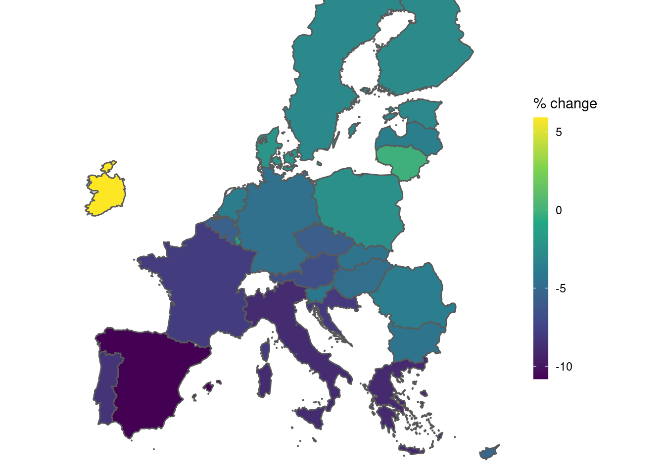
Some more changes now. We will add more breaks on the legend colorbar. We see that values range from -11 to +6. We will use this range. It also a good idea to make the border line thiner, or even to change the color to something close to white. And, we will place the legend inside the white space of plot, to reduce the empty space of the plot.
tec00115_shp %>%
  ggplot(aes(fill = values)) +
  geom_sf(size = 0.2, color = "#F3F3F3") + # border line
  scale_fill_continuous(
    type = "viridis",
    name = "% change",                    # title of the legend
    breaks = seq(from = -11, to = 6, by = 2),
    guide = guide_colorbar(
      direction = "vertical",             # vertical colorbar
      title.position = "top",             # title displayed at the top
      label.position = "right",           # labels displayed at the right side
      barwidth = unit(0.4, "cm"),         # width of the colorbar
      barheight = unit(7, "cm"),          # height of the colorbar
      ticks = TRUE,                       # ticks are displayed
    )
  ) +
  scale_x_continuous(limits = c(-10, 35)) +
  scale_y_continuous(limits = c(35, 65)) +
  theme_void() +
  theme(
    legend.position = c(0.97, 0.50)   # relative horizontal, vertical position
  )
4.3.2 Titles
Now we add some explanation title on the plot. In general, a plot might have: title, subtitle and a caption. Here is how:
tec00115_shp %>%
  ggplot(aes(fill = values)) +
  geom_sf(size = 0.2, color = "#F3F3F3") + # border line
  scale_fill_continuous(
    type = "viridis",
    name = "% change",
    breaks = seq(from = -11, to = 6, by = 2),
    guide = guide_colorbar(
      direction = "vertical",
      title.position = "top",
      label.position = "right",
      barwidth = unit(0.4, "cm"),
      barheight = unit(7, "cm"),
      ticks = TRUE,
    )
  ) +
  scale_x_continuous(limits = c(-10, 35)) +
  scale_y_continuous(limits = c(35, 65)) +
  labs(
    title = "Real GDP growth rate in EU",
    subtitle = "Annual % of change, 2020 vs 2019",
    caption = "Data: Eurostat tec00115"
  ) +
  theme_void() +
  theme(
    legend.position = c(0.97, 0.50)
  )
4.4 Changing the palette
We move now beyond scale_fill_continuous. The first we can consider is to the brewer palettes. We must have in mind that values we want to plot are continuous.
4.4.1 Brewer colors with distiller
First choice is to use the classical brewer colors. In ggplot we must use scale_fill_distiller For example:
tec00115_shp %>%
  ggplot(aes(fill = values)) +
  geom_sf() +
  scale_fill_distiller(palette = 12) +
  scale_x_continuous(limits = c(-10, 35)) +
scale_y_continuous(limits = c(35, 65)) 
palette can take any number from 1 to 18. Pick of specific color palette is arbitary and depends on user aesthetics.
Here low values are represented with dark purple color. If we want to change it, for example having dark purple to represent high values we might write:
tec00115_shp %>%
  ggplot(aes(fill = values)) +
  geom_sf() +
  scale_fill_distiller(
    palette = 12,
    direction = 1   # reverse default order
  ) +
  scale_x_continuous(limits = c(-10, 35)) +
scale_y_continuous(limits = c(35, 65)) 
This trick applies to all palettes ofcourse. Should we use it? It depends on what we want to display, or to what we want to emphasize.
The distiller color scales are adapted from brewer color scales. Sequential palettes can either be specified by a number (1:18) or by name: Blues, BuGn, BuPu, GnBu, Greens, Greys, Oranges, OrRd, PuBu, PuBuGn, PuRd, Purples, RdPu, Reds, YlGn, YlGnBu, YlOrBr, YlOrRd.
For example we might write:
instead of :
4.4.2 fermenter
Another choice is to use the scale_fill_fermenter function in ggplot:
tec00115_shp %>%
  ggplot(aes(fill = values)) +
  geom_sf() +
  scale_fill_fermenter(palette = "PuBu") +
  scale_x_continuous(limits = c(-10, 35)) +
scale_y_continuous(limits = c(35, 65)) 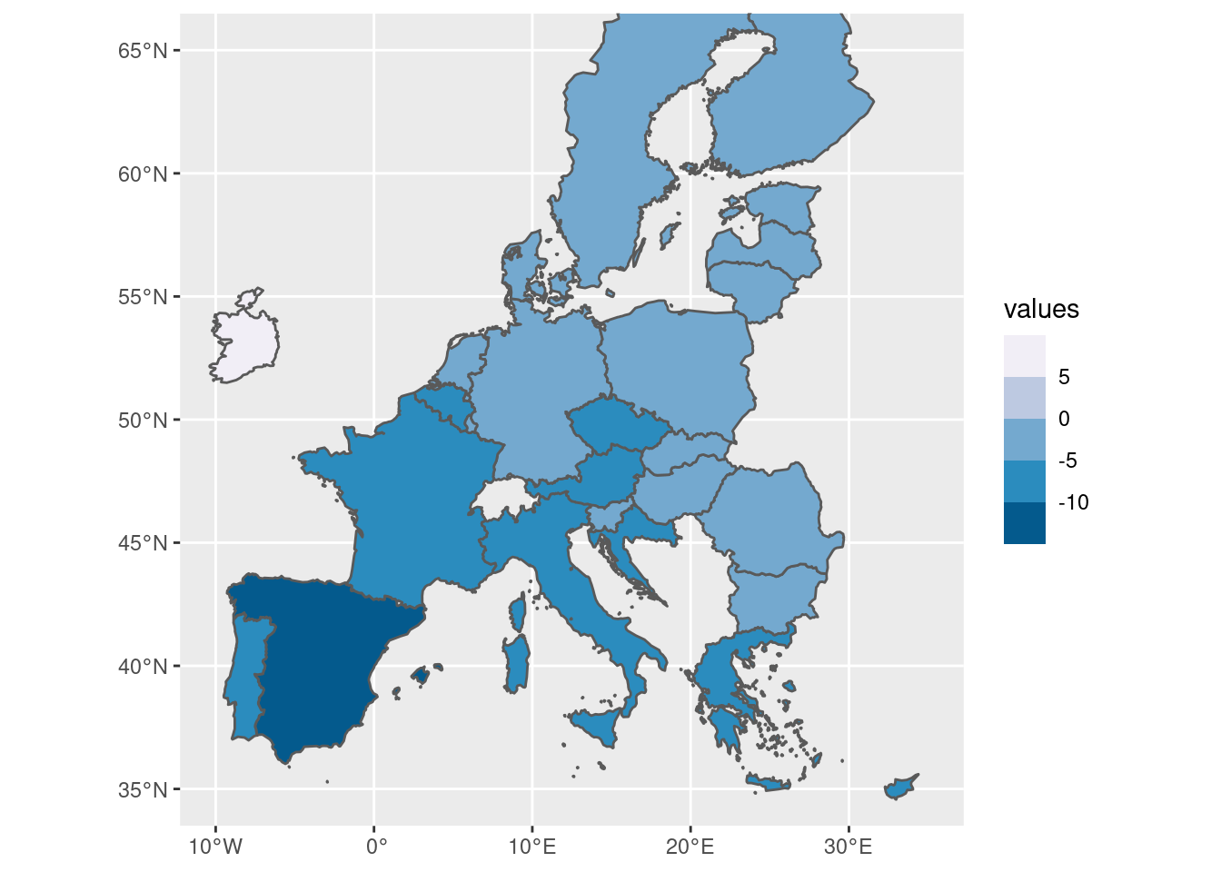
As we see, values now are cut into ranges. For example, Austria’s -6.7 ang Greece’s -9.0 values correspond to exactly same color because they fall into the same range.
If we want to change the default breaks we must provide a corresponding vector of values, for example:
tec00115_shp %>%
  ggplot(aes(fill = values)) +
  geom_sf() +
  scale_fill_fermenter(
    palette = "PuBu",
    breaks = seq(-11, 6, by = 3) # change the breaks
  ) +
  scale_x_continuous(limits = c(-10, 35)) +
scale_y_continuous(limits = c(35, 65)) 
4.4.3 Color gradients
tec00115_shp %>%
  ggplot(aes(fill = values)) +
  geom_sf() +
  scale_fill_gradient(
    low = "red",
    high = "green"
  ) +
  scale_x_continuous(limits = c(-10, 35)) +
scale_y_continuous(limits = c(35, 65)) 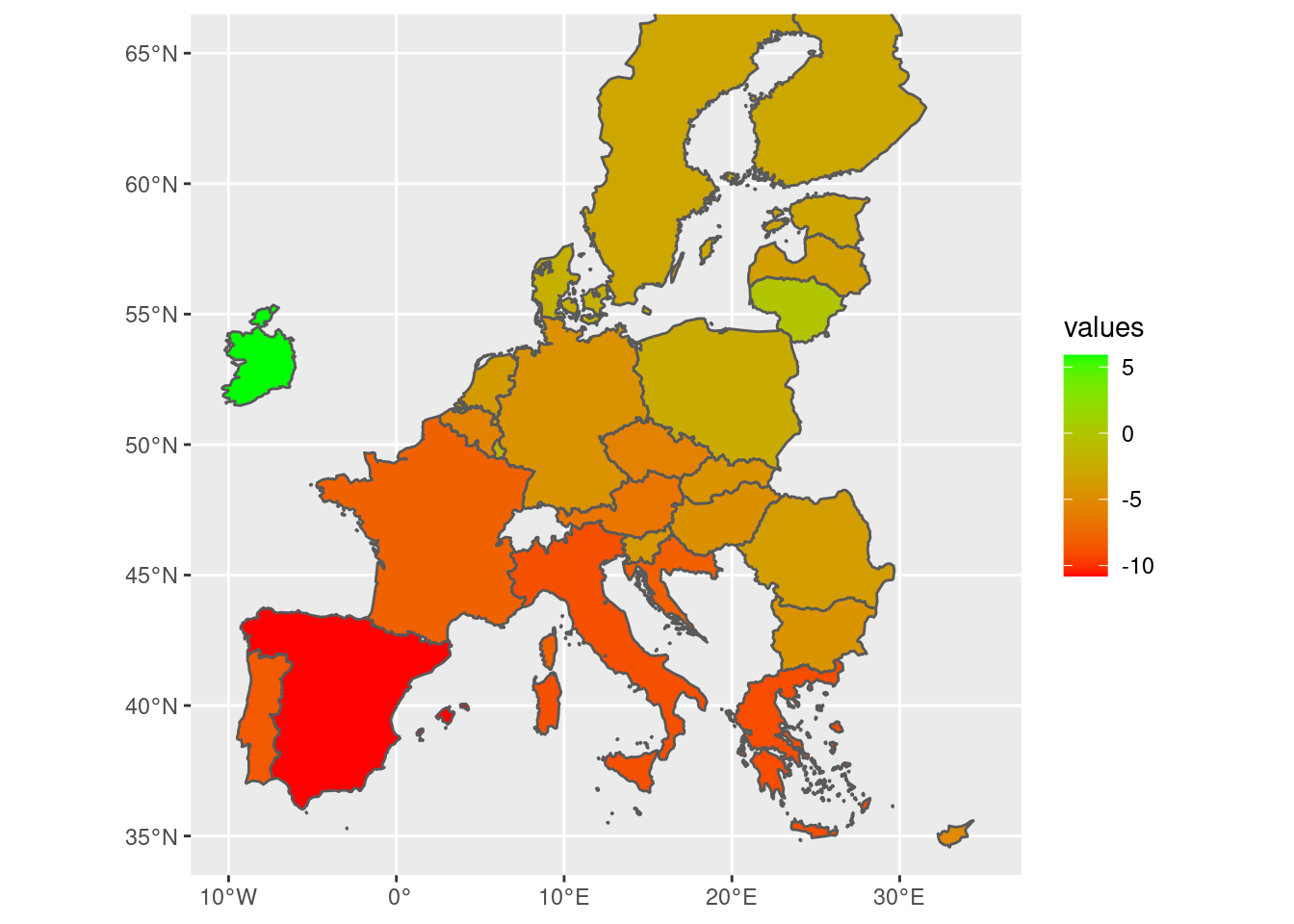
tec00115_shp %>%
  ggplot(aes(fill = values)) +
  geom_sf() +
  scale_fill_gradient2(
    low = "red",
    high = "green",
    mid = "yellow"
  ) +
  scale_x_continuous(limits = c(-10, 35)) +
scale_y_continuous(limits = c(35, 65)) 
tec00115_shp %>%
  ggplot(aes(fill = values)) +
  geom_sf() +
  scale_fill_gradient2(
    low = "red",
    high = "green",
    mid = "yellow",
    midpoint = -5
  ) +
  scale_x_continuous(limits = c(-10, 35)) +
scale_y_continuous(limits = c(35, 65)) 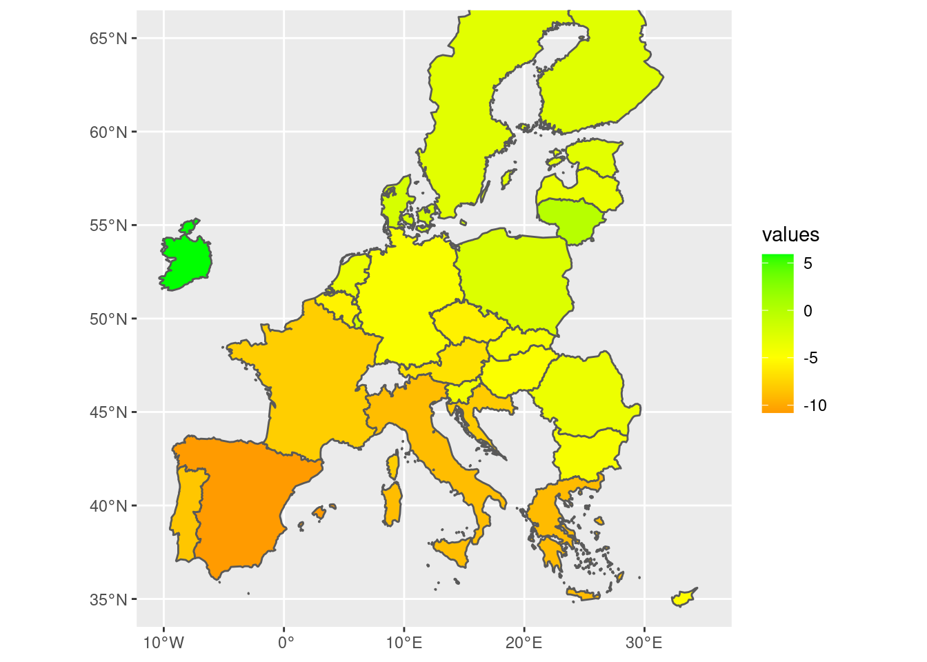
4.4.4 tableau style of colors
Tableau is a popular data visualization program. R’s ggthemes implements some of its color schemes.
A basic usage is the scale_fill_continuous_tableau function, for example:
tec00115_shp %>%
  ggplot(aes(fill = values)) +
  geom_sf() +
  scale_fill_continuous_tableau() +
  scale_x_continuous(limits = c(-10, 35)) +
scale_y_continuous(limits = c(35, 65)) 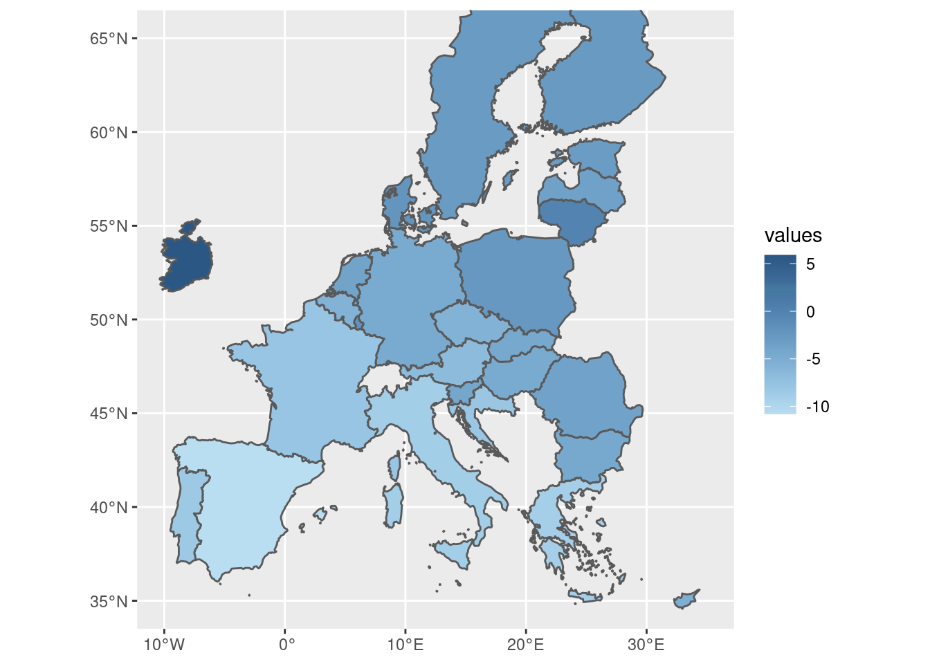
There are several palettes available. We might check them by calling the help:
It is very useful to see the help file and explore some other palettes.
Sequential palette using two colors:
tec00115_shp %>%
  ggplot(aes(fill = values)) +
  geom_sf() +
  scale_fill_gradient_tableau(palette = "Purple") +
  scale_x_continuous(limits = c(-10, 35)) +
scale_y_continuous(limits = c(35, 65)) 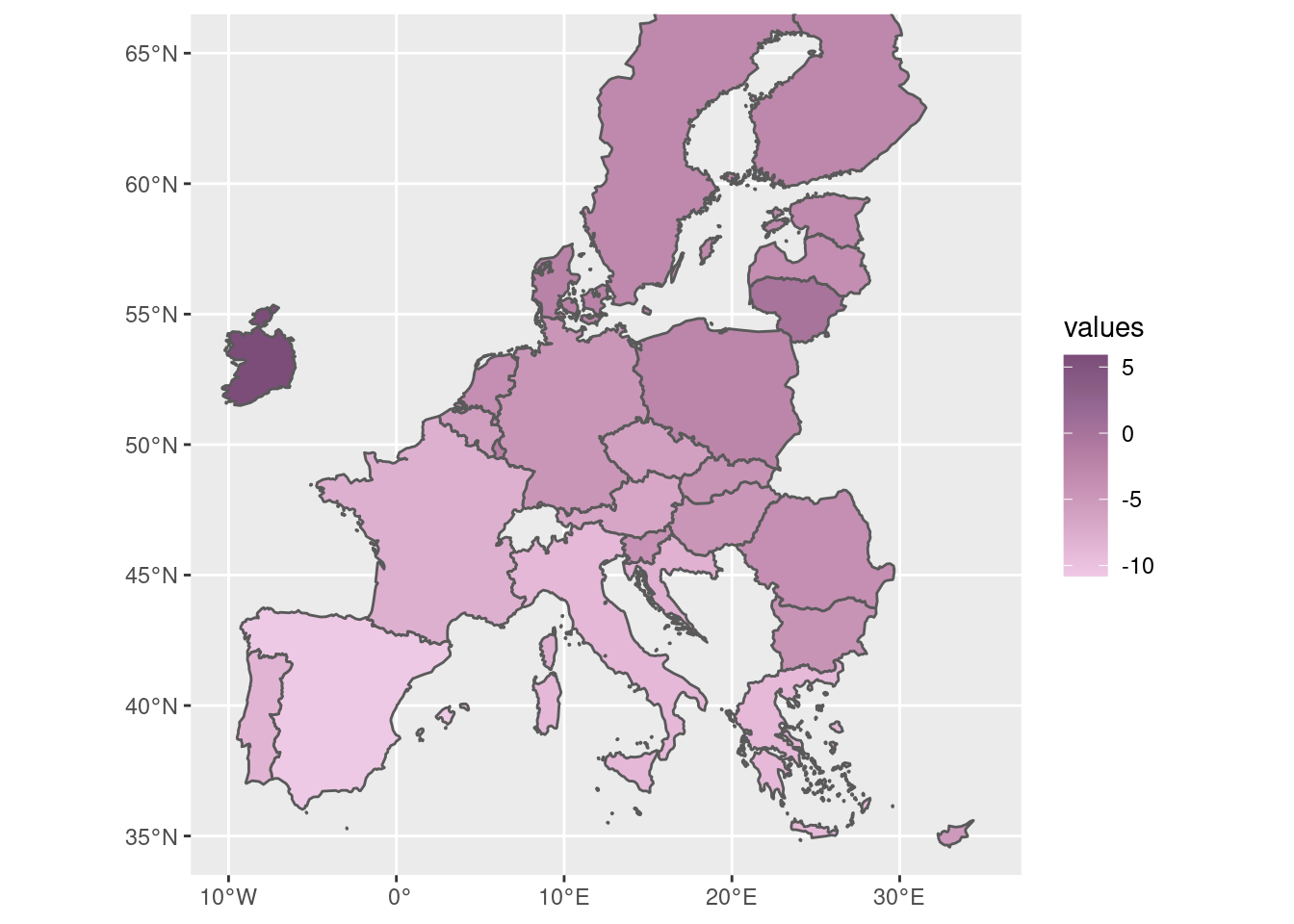
Divergent palette using three colors:
tec00115_shp %>%
  ggplot(aes(fill = values)) +
  geom_sf() +
  scale_fill_gradient2_tableau(palette = "Red-Blue-White Diverging") +
  scale_x_continuous(limits = c(-10, 35)) +
scale_y_continuous(limits = c(35, 65)) 
4.4.5 A final touch
tec00115_shp %>%
  ggplot(aes(fill = values)) +
  geom_sf(
    size = 0.1,
    color = "#F3F3F3"
  ) +
  scale_fill_gradient2_tableau(
    palette = "Temperature Diverging",
    name = "%",
    breaks = pretty_breaks(10),
    guide = guide_colorbar(
      direction = "vertical",
      title.position = "top",
      label.position = "right",
      barwidth = unit(0.4, "cm"),
      barheight = unit(7, "cm"),
      ticks = TRUE,
    )
  ) +
  scale_x_continuous(limits = c(-10, 35)) +
  scale_y_continuous(limits = c(35, 65)) +
  labs(
    title = "Real GDP growth rate in EU",
    subtitle = "Annual % of change, 2020 vs 2019",
    caption = "Data: Eurostat tec00115"
  ) +
  theme_void() +
  theme(legend.position = c(0.97, 0.50))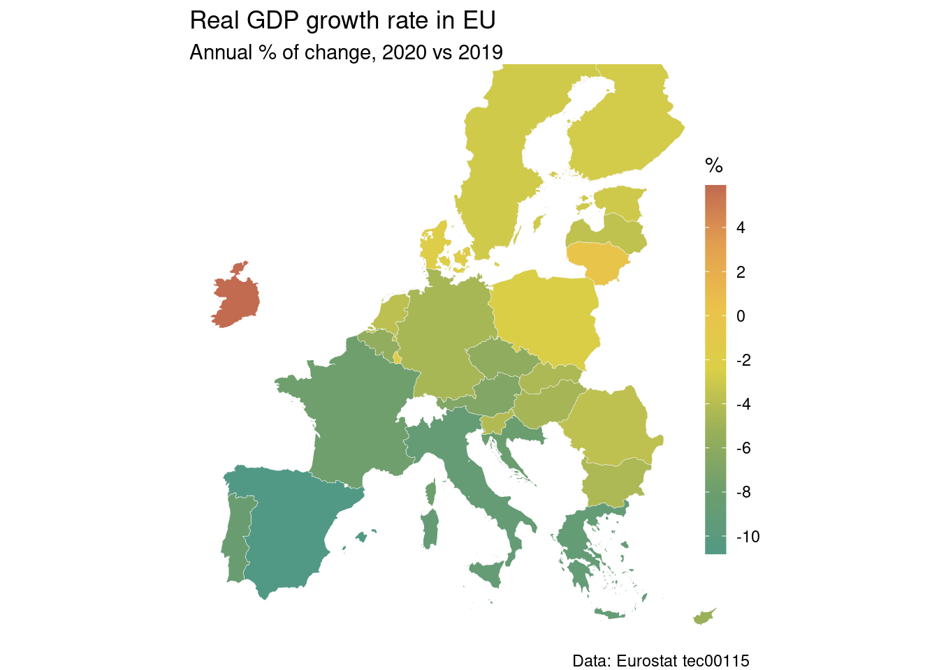
4.5 Changing the projection
We can transform the oordinates system. Many systems are available, we will use the ETRS89-extended/LAEA Europe here:
We can we how it looks now, for example all the countries:
SHP_0_3035  %>%
  ggplot() +
  geom_sf() +
  scale_x_continuous(limits = c(2800000, 7150000)) +
scale_y_continuous(limits = c(1380000, 5300000)) 
Or just the EU27 countries:
SHP_27_3035  %>%
  ggplot() +
  geom_sf() +
  scale_x_continuous(limits = c(2750000, 6500000)) +
  scale_y_continuous(limits = c(1530000, 4800000))
This projection provides a better analogy to real world,
it is bit more realistic about the size of the norhtern countries.
We can of course join our data to this shapefile:
This projection provides a better analogy to real world,
it is bit more realistic about the size of the norhtern countries.
We can of course join our data to this shapefile:
tec00115_shp_3035 <- tec00115 %>%
  filter(unit == 'CLV_PCH_PRE') %>%
  filter(time == 2020) %>%
  select(geo, values) %>%
  inner_join(SHP_27_3035, by = "geo") %>%
  st_as_sf()
And now we may apply any choropleth style map, for example:
tec00115_shp_3035 %>%
  ggplot(aes(fill = values)) +
  geom_sf(
    size = 0.1,
    color = "#F3F3F3"
  ) +
  scale_fill_gradient2_tableau(
    palette = "Temperature Diverging",
    name = "%",
    breaks = pretty_breaks(10),
    guide = guide_colorbar(
      direction = "vertical",
      title.position = "top",
      label.position = "right",
      barwidth = unit(0.4, "cm"),
      barheight = unit(7, "cm"),
      ticks = TRUE,
    )
  ) +
  scale_x_continuous(limits = c(2750000, 6500000)) +
  scale_y_continuous(limits = c(1530000, 4800000)) +
  labs(
    title = "Real GDP growth rate in EU",
    subtitle = "Annual % of change, 2020 vs 2019",
    caption = "Data: Eurostat tec00115"
  ) +
  theme_void() +
  theme(
    legend.position = c(0.95, 0.60)
  )
4.6 Theme manipulations
Some times we need to produce multiple choropleth maps that have the same style but represent different data. We will use as an example the tin00028 dataset: Internet use by individuals. It is an annual survey and provides four indices:
- I_IU3, Last internet use: in last 3 months
- I_ILT12, Last internet use: in the last 12 months
- I_IUEVR, Individuals who have ever used the internet
- I_IUX, Internet use: never
Let us suppose we want to construct four maps, one for each index. One way to repeat the whole procedure four times. Another, more efficient way, is to update the theme settings so we do not have to define it each time.
OK, let us first read the data:
And we can construct the geospatial dataset (year 2021) as follows:
tin00028_shp_3035 <- tin00028 %>%
  filter(time == 2019) %>%
  select(geo, indic_is, values) %>%
  right_join(SHP_0_3035, by = "geo") %>%
  st_as_sf()
Pay attention that we four values for each country we have. For example, let us look at Austria:
## Simple feature collection with 4 features and 13 fields
## Geometry type: MULTIPOLYGON
## Dimension:     XY
## Bounding box:  xmin: 4285465 ymin: 2595157 xmax: 4854633 ymax: 2890133
## Projected CRS: ETRS89-extended / LAEA Europe
## # A tibble: 4 × 14
##   geo   indic_is values id    LEVL_CODE NUTS_ID CNTR_CODE NAME_LATN  NUTS_NAME
## * <chr> <chr>     <dbl> <chr>     <int> <chr>   <chr>     <chr>      <chr>
## 1 AT    I_ILT12      88 AT            0 AT      AT        ÖSTERREICH ÖSTERREICH
## 2 AT    I_IU3        88 AT            0 AT      AT        ÖSTERREICH ÖSTERREICH
## 3 AT    I_IUEVR      90 AT            0 AT      AT        ÖSTERREICH ÖSTERREICH
## 4 AT    I_IUX        10 AT            0 AT      AT        ÖSTERREICH ÖSTERREICH
## # … with 5 more variables: MOUNT_TYPE <int>, URBN_TYPE <int>, COAST_TYPE <int>,
## #   FID <chr>, geometry <MULTIPOLYGON [m]>
The idea we have to implement now is to construct four maps, the same but different data to show.
tin00028_shp_3035 %>%
  filter(indic_is == 'I_ILT12') %>%
  ggplot(aes(fill = values)) +
  geom_sf(
    size = 0.1,
    color = "#F3F3F3"
  ) +
  scale_fill_stepsn(
    colors = palette.colors(palette = "Okabe-Ito", n = 5),
    name = "%",
    n.breaks = 4,
    nice.breaks = FALSE,
    show.limits = TRUE,
    na.value = "gray90",
    guide = guide_colorsteps(
      direction = "vertical",
      title.position = "top",
      label.position = "right",
      barwidth = unit(0.4, "cm"),
      barheight = unit(6, "cm"),
      ticks = TRUE,
    )
  ) +
  scale_x_continuous(limits = c(2500000, 7000000)) +
  scale_y_continuous(limits = c(1600000, 5200000)) +
  labs(
    title = "Internet use by individuals",
    subtitle = "Eurostat, 2019",
    caption = "Data: Eurostat tin00028"
  ) +
  theme_void() +
  theme(legend.position = c(0.94, 0.70))
Now the question is: How can we modify the default setting of the theme so that next plot comes with less code? For example, parts of the code we do not need to repeat:
- scale_fill_stepsn section
- scale_x_continuous
- scale_y_continuous
- geom_sf
- aes
- title
- theme
In general, we put all common parts of the plot in list:
gg_theme <- list(
  theme_void(),
  theme(legend.position = c(0.94, 0.70)),
  scale_x_continuous(limits = c(2500000, 7000000)),
  scale_y_continuous(limits = c(1600000, 5200000)),
  aes(fill = values),
  geom_sf(
    size = 0.1,
    color = "#F3F3F3"
  ),
  scale_fill_stepsn(
    colors = palette.colors(palette = "Okabe-Ito", n = 5),
    name = "%",
    n.breaks = 4,
    nice.breaks = FALSE,
    show.limits = TRUE,
    na.value = "gray90",
    guide = guide_colorsteps(
      direction = "vertical",
      title.position = "top",
      label.position = "right",
      barwidth = unit(0.4, "cm"),
      barheight = unit(6, "cm"),
      ticks = TRUE,
    )
  ),
  labs(
    subtitle = "Eurostat, 2019",
    caption = "Data: Eurostat tin00028"
  )
)
And now comes the magic. Here is how we produce four identical-styled plots.
4.6.1 Last internet use: in the last 12 months
tin00028_shp_3035 %>%
  filter(indic_is == 'I_ILT12') %>%
  ggplot() +
  labs(title = "Last internet use: in the last 12 months") +
  gg_theme
4.6.2 Last internet use: in last 3 months
tin00028_shp_3035 %>%
  filter(indic_is == 'I_IU3') %>%
  ggplot() +
  labs(title = "Last internet use: in the last 12 months") +
  gg_theme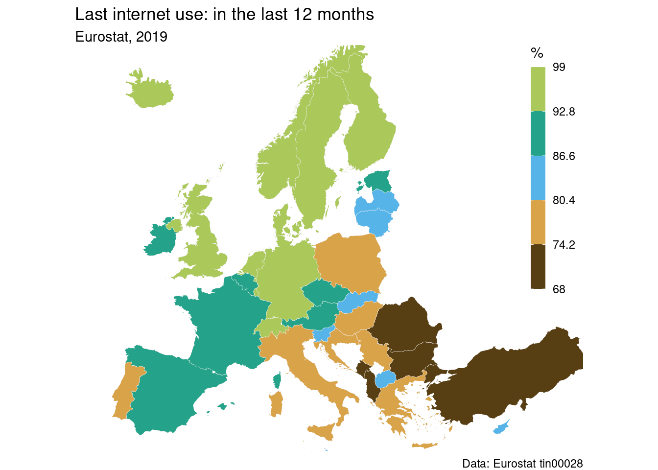
4.6.3 Last internet use: in last 3 months
tin00028_shp_3035 %>%
  filter(indic_is == 'I_IUEVR') %>%
  ggplot() +
  labs(title = "Individuals who have ever used the internet") +
  gg_theme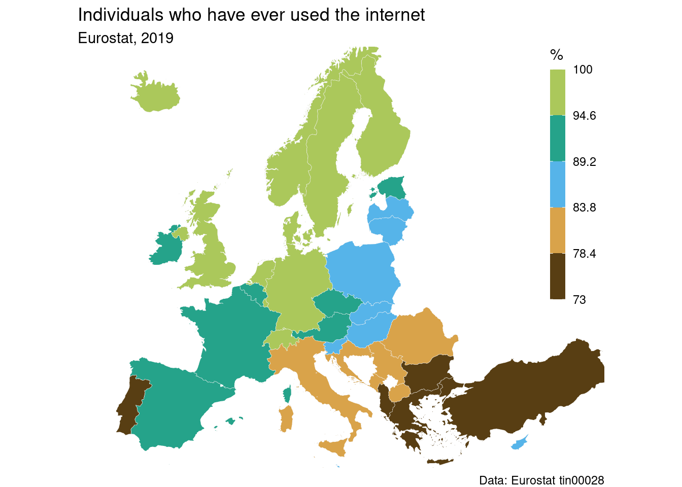
4.6.4 Last internet use: never
tin00028_shp_3035 %>%
  filter(indic_is == 'I_IUX') %>%
  ggplot() +
  labs(title = "Internet use: never") +
  gg_theme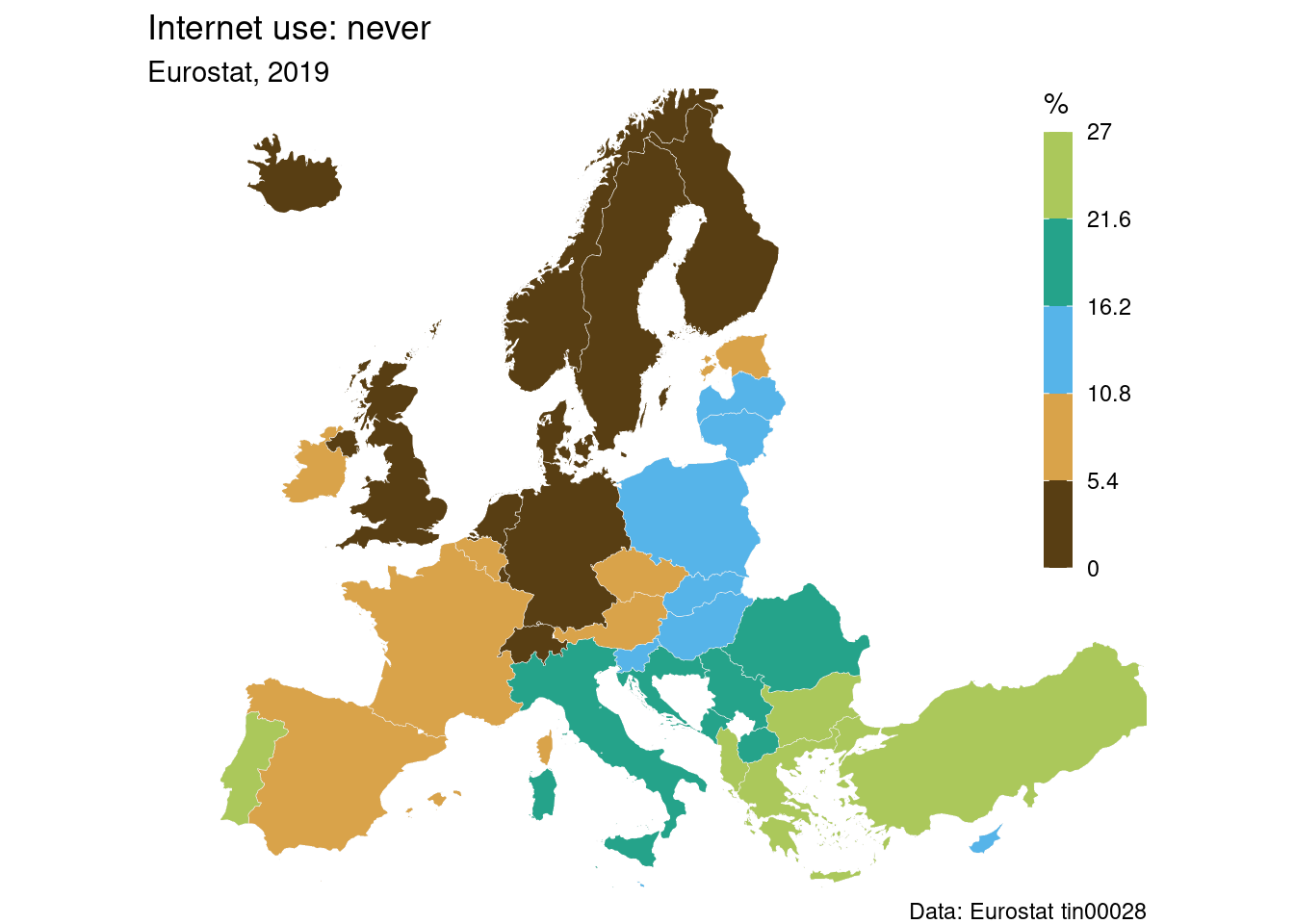
4.7 Regions of Europe
Until now we have dealed with country level data. Eurostat also distributes regional data on three levels:
- Major socio-economic regions (NUTS1)
- Basic regions for the application of regional policies (NUTS2)
- Small regions for specific diagnoses (NUTS3)
What exactly is a specific NUTS region varies from country to country. More detailed information can be found in EC NUTS classification and shapefiles can be found in GISCO webiste
Because most policy decisions refer to NUTS2 level we will deal in this section with an example at NUTS2 level. More regional datasets can be found here: Eurostat regional statistics
Shapefiles of regions NUTS can be downloaded via:
Attention, we set the option to crs=3035, so we do not need later to convert the coordination system.
Now, as an example we get the dataset edat_lfse_04 about educational level of population at NUTS2 level:
First we can filter the data to obtain percentage of population aged 24-34 with at least tertiary education (isced11 5-8) as surveyed during 2020, and then we can join with the shapefile to construct a geospatial dataset:
edat_lfse_04_shp <- edat_lfse_04 %>%
  filter(sex == 'T') %>%               # both males and females
  filter(isced11 == 'ED5-8') %>%       # level of education
  filter(age == 'Y25-34') %>%          # age between 25 and 34
  filter(time == 2020) %>%             # during 2020
  select(geo, values) %>%
  right_join(SHP_2_3035, by = "geo") %>%
  st_as_sf()
Now we can plot the choropleth map. We can apply a continuous scale with brewer colors (scale_fill_distiller) but of course other choices are also valid:
edat_lfse_04_shp %>%
  ggplot(aes(fill = values)) +
  geom_sf(
    size = 0.1,
    color = "#333333"
  ) +
  scale_fill_distiller(
    palette = "YlGnBu",
    direction = 1,
    name = "%",
    breaks = pretty_breaks(10),
    na.value = "gray80",
    guide = guide_colorbar(
      direction = "vertical",
      title.position = "top",
      label.position = "right",
      barwidth = unit(0.4, "cm"),
      barheight = unit(6, "cm"),
      ticks = TRUE,
    )
  ) +
  scale_x_continuous(limits = c(2500000, 7000000)) +
  scale_y_continuous(limits = c(1600000, 5200000)) +
  labs(
    title = "Population by educational attainment level",
    subtitle = "ISCED 5-8, at least tertiary educational level during 2020",
    caption = "Data: Eurostat edat_lfse_04"
  ) +
  theme_void() +
  theme(legend.position = c(0.94, 0.70))