3 Time series data
3.1 Querterly data
With the term time series data we mean data that vary over time. For example population of a country changes from one year to another. or exchange rate between EUR and USD change from one day to another.
Here we are going to examine some simple cases of time series in EU.
Libraries we will need:
3.2 Annual data, Imports and Exports as example as example
3.2.1 One variable or values for one country
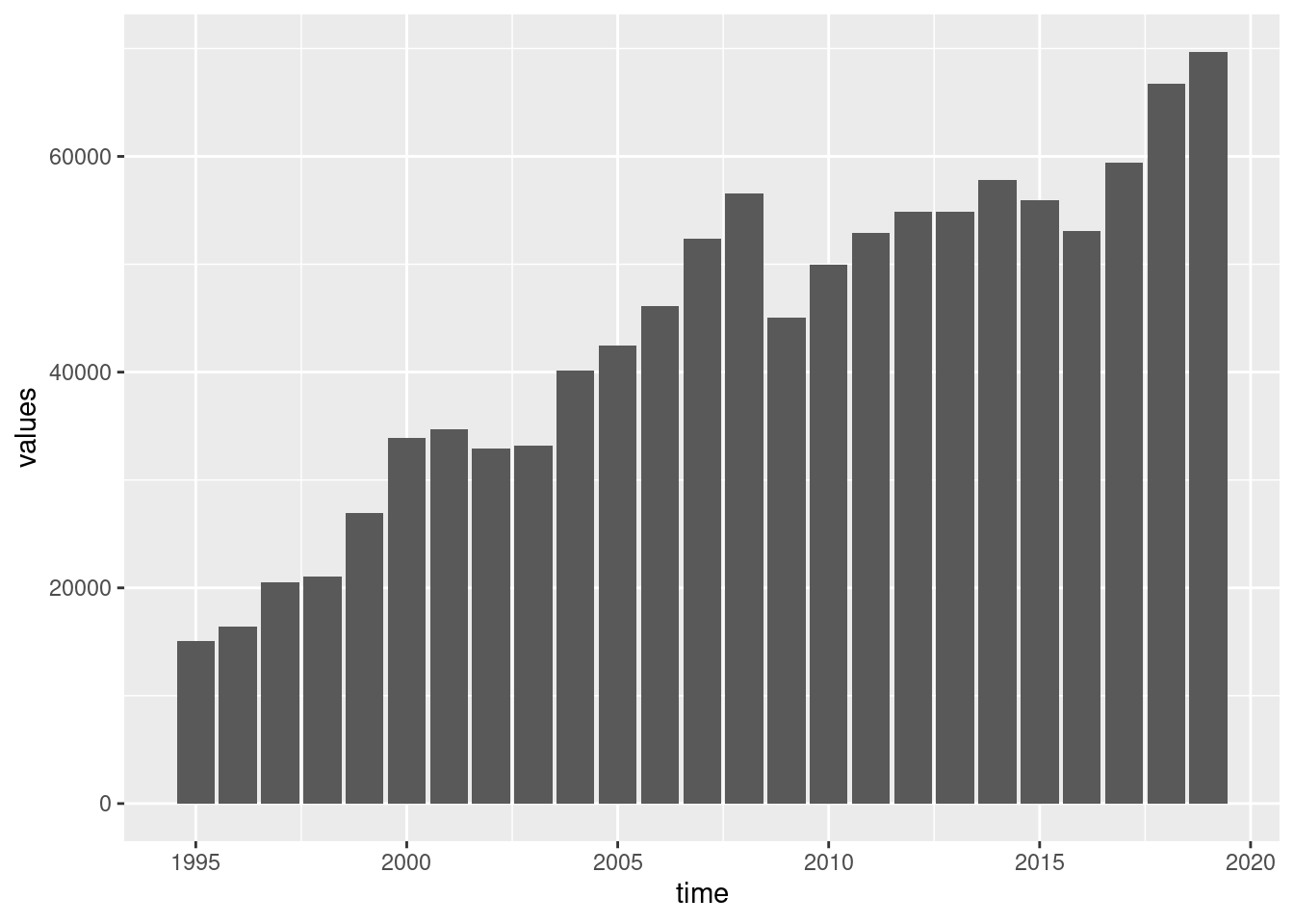
Table nama_10_exi contains information of imports and exports of EU countries. Let’s see for example exports of Greece:
cntr_nama <- nama_10_exi %>%
  filter(geo == 'EL') %>%
  filter(na_item == 'P6') %>%
  filter(unit == 'CP_MEUR')
And a single bar chart:
Or a line version:

Or a line with points:
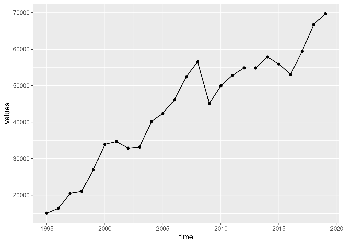
With some adjustment of looking:
cntr_nama <- nama_10_exi %>%
filter(geo == 'EL') %>%
filter(na_item == 'P6') %>%
filter(unit == 'CP_MEUR') %>%
mutate(values = 1e-3*values)
ggplot(cntr_nama, aes(x = time, y = values)) +
geom_line() +
geom_point() +
labs(x = "Year", y = "Exports (Bil. EUR)") +
scale_x_continuous(breaks = seq(1998, 2020, by = 4)) +
scale_y_continuous(limits = c(0, 80)) +
theme_bw() +
theme(text = element_text(size = 16),
axis.text = element_text(size = 14))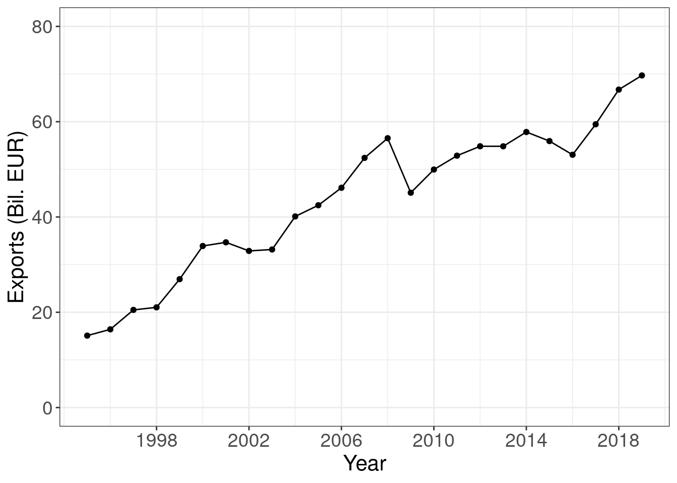
Pay attention, we first transform the values (mutate) from millions or EUR to billions of EUR:
nama_10_exi %>%
filter(geo == 'EL') %>%
filter(na_item == 'P6') %>%
filter(unit == 'CP_MEUR') %>%
mutate(values = 1e-3*values)## # A tibble: 25 × 5
## unit na_item geo time values
## <chr> <chr> <chr> <dbl> <dbl>
## 1 CP_MEUR P6 EL 2019 69.7
## 2 CP_MEUR P6 EL 2018 66.7
## 3 CP_MEUR P6 EL 2017 59.5
## 4 CP_MEUR P6 EL 2016 53.1
## 5 CP_MEUR P6 EL 2015 55.9
## 6 CP_MEUR P6 EL 2014 57.8
## 7 CP_MEUR P6 EL 2013 54.8
## 8 CP_MEUR P6 EL 2012 54.8
## 9 CP_MEUR P6 EL 2011 52.9
## 10 CP_MEUR P6 EL 2010 50.0
## # … with 15 more rowsPlot time series as the Economist:
ggplot(cntr_nama, aes(x = time, y = values, colour = geo)) +
geom_line(size = 1.25) +
labs(x = "Year", y = "Exports (Bil. EUR)") +
scale_x_continuous(breaks = seq(1998, 2020, by = 4)) +
scale_y_continuous(limits = c(0, 80)) +
theme_economist() +
scale_color_economist() +
theme(legend.position = "none") +
theme(text = element_text(size = 16),
axis.text = element_text(size = 14))
Plot time series as the Wall Street Journal:
ggplot(cntr_nama, aes(x = time, y = values, colour = geo)) +
geom_line(size = 1.25) +
labs(title = "Exports (Bil. EUR)") +
scale_x_continuous(breaks = seq(1998, 2020, by = 4)) +
scale_y_continuous(limits = c(0, 80)) +
theme_wsj() +
scale_color_wsj() +
theme(legend.position = "none") +
theme(text = element_text(size = 16),
axis.text = element_text(size = 14))
3.2.2 Two or more variables
Let’s take export data for both Greece and Portugal:
cntr_nama <- nama_10_exi %>%
filter(geo %in% c('EL', 'PT')) %>%
filter(na_item == 'P6') %>%
filter(unit == 'CP_MEUR') %>%
mutate(values = 1e-3*values)ggplot(cntr_nama, aes(x = time, y = values, colour = geo, linetype = geo)) +
geom_line() +
geom_point() +
labs(x = "Year", y = "Exports (Bil. EUR)") +
scale_x_continuous(breaks = seq(1998, 2020, by = 4)) +
scale_y_continuous(limits = c(0, 80)) +
scale_color_brewer(type = "qual", palette = 6) +
theme_classic() +
theme(text = element_text(size = 16),
axis.text = element_text(size = 14))## Warning: Removed 3 row(s) containing missing values (geom_path).## Warning: Removed 3 rows containing missing values (geom_point).
So far so good, especially beacause data of Greece and Portugal are of the same scale. What happens if we include Spain?
cntr_nama <- nama_10_exi %>%
filter(geo %in% c('EL', 'PT', 'ES')) %>%
filter(na_item == 'P6') %>%
filter(unit == 'CP_MEUR') %>%
mutate(values = 1e-3*values)ggplot(cntr_nama, aes(x = time, y = values, colour = geo, linetype = geo)) +
geom_line() +
geom_point() +
labs(x = "Year", y = "Exports (Bil. EUR)") +
scale_x_continuous(breaks = seq(1998, 2020, by = 4)) +
scale_color_brewer(type = "qual", palette = 6) +
theme_classic() +
theme(text = element_text(size = 16),
axis.text = element_text(size = 14))
Yes, the plot is not working any more. Plotting data of very different scale is not a good idea. A work around could be:
ggplot(cntr_nama, aes(x = time, y = values)) +
  geom_line() +
geom_point() +
labs(x = "Year", y = "Exports (Bil. EUR)") +
scale_x_continuous(breaks = .14) +
theme_classic() +
theme(text = element_text(size = 16),
axis.text = element_text(size = 14)) +
facet_wrap(~geo, scales = "free") +
theme(legend.position = "none")
3.2.3 Compare imports and exports
Now let’s compare imports and exports in Greece.
cntr_nama <- nama_10_exi %>%
  filter(geo %in% c('EL')) %>%
  filter(na_item %in% c('P6', 'P7')) %>%
  filter(unit == 'CP_MEUR') %>%
  mutate(values = 1e-3*values)

ggplot(cntr_nama, aes(x = time, y = values, colour = na_item)) +
  geom_line(size = 1.25) +
  labs(x = "Year", y = "Amount (Bil. EUR)") +
  scale_x_continuous(breaks = seq(1995, 2025, by = 5)) +
  scale_y_continuous(breaks = seq(0, 80, by = 20)) +
  scale_color_tableau(palette = "Classic 10", name = "", labels = c("Exports", "Imports")) +
  theme_bw() +
  theme(text        = element_text(size = 16),
        axis.text   = element_text(size = 14),
        legend.text = element_text(size = 16),
legend.position = c(0.1, 0.88)) 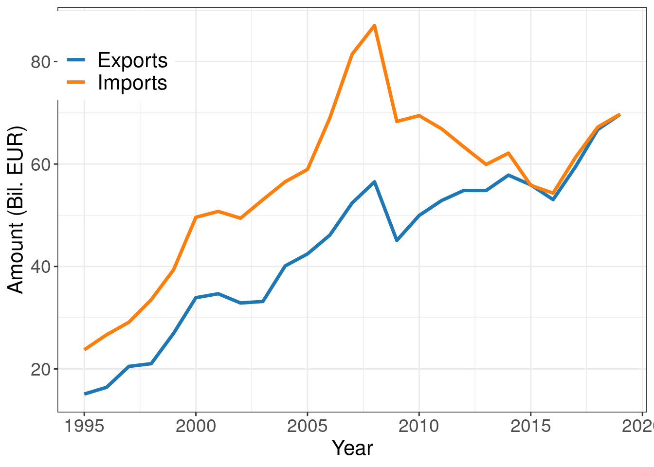
Another nice plot is with coloring the area between two lines in order to emphasize the different (trade balance). First, we transform the data in order to include min, max values as separate columns:
cntr_nama <- nama_10_exi %>%
  filter(geo %in% c('EL')) %>%
  filter(na_item %in% c('P6', 'P7')) %>%
  filter(unit == 'CP_MEUR') %>%
  mutate(values = 1e-3*values) %>%
  pivot_wider(id_cols = c(na_item, time),
              names_from = na_item,
              values_from = values) %>%
  rowwise() %>%
  mutate(y1 = min(P6, P7),
         y2 = max(P6, P7)) %>%
  pivot_longer(cols = c(P6, P7),
               names_to = "na_item",
               values_to = "values")
Then we add (geom_ribbon) the colored area between two lines
ggplot(cntr_nama, aes(x = time, y = values, colour = na_item)) +
  geom_line(size = 1.25) +
  geom_ribbon(aes(x = time, ymin = y1, ymax = y2),
              fill = "#F4F1E5FF",
              inherit.aes = FALSE) +
  labs(x = "Year", y = "Amount (Bil. EUR)") +
  scale_x_continuous(breaks = seq(1996, 2030, by = 4)) +
  scale_y_continuous(breaks = seq(0, 100, by = 20)) +
  scale_color_tableau(palette = "Classic 10", name = "", labels = c("Exports", "Imports")) +
  theme_economist_white() +
  theme(panel.grid  = element_blank(),
        text        = element_text(size = 16),
        axis.text   = element_text(size = 14),
        legend.text = element_text(size = 16)) +
  theme(legend.position = c(0.1, 0.9)) +
  annotate(geom = "text", x = 2011, y = 46, label = "Exports", size = 6) +
annotate(geom = "text", x = 2011, y = 72, label = "Imports", size = 6) 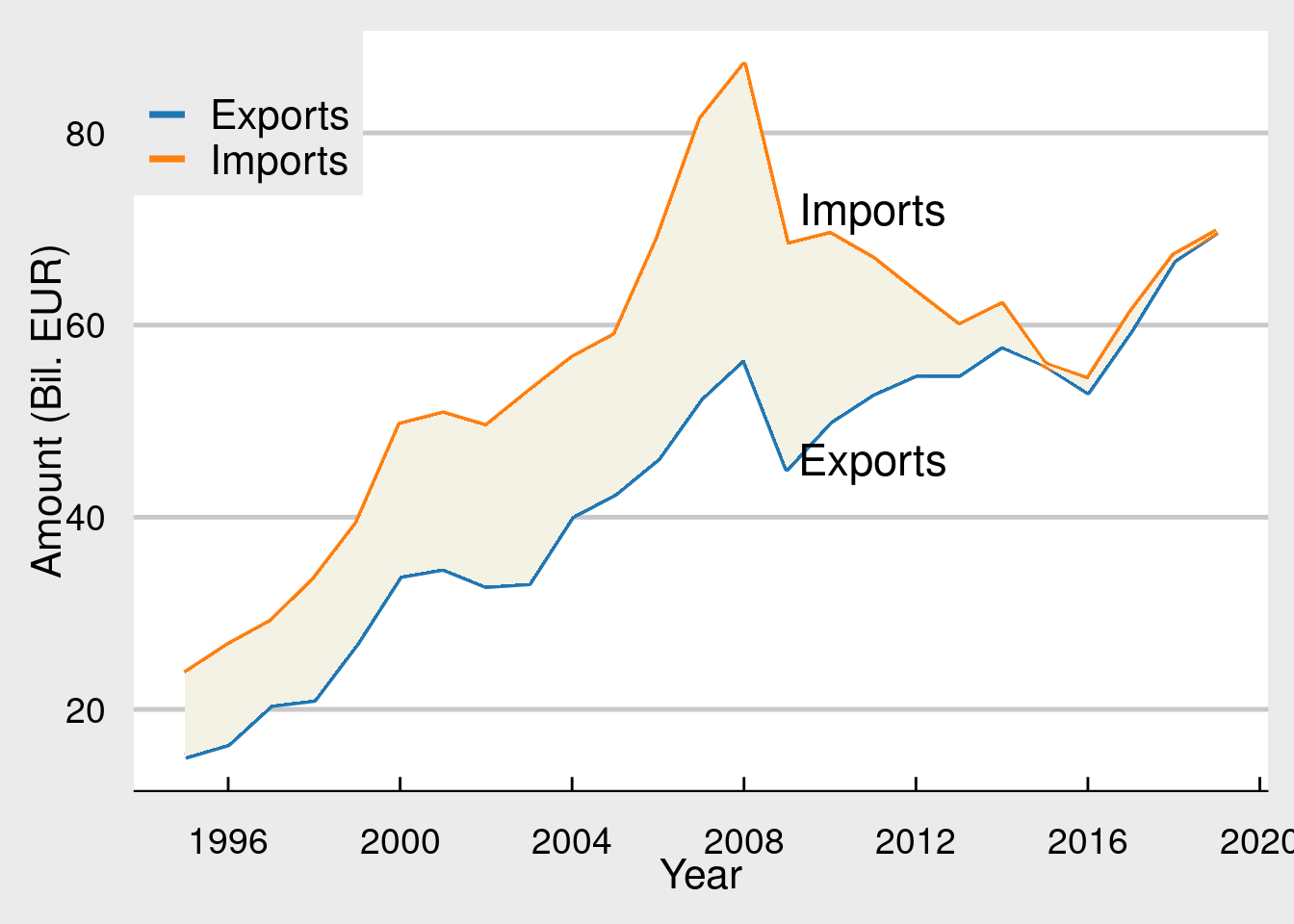
3.3 Quartely data, GDP as example
Quartely data in economic time series are very important. The most well known time series reports every three months is the GDP (gross domestic product) of a country’s economy. Quarterly data about EU’s GDP are held in the namq_10_gdp dataset. It can be easily downloaded from Eurostat:
The namq_10_gdp contains a lot of information about the GDP and its componenets. User is advised to look at Eurostat’s metadata page for more details. Here we will look at some main characteristics of the GDP.
First of all let us look at the structure of the table:
## tibble [5,510,713 × 6] (S3: tbl_df/tbl/data.frame)
##  $ unit   : chr [1:5510713] "CLV05_MEUR" "CLV05_MEUR" "CLV05_MEUR" "CLV05_MEUR" ...
##  $ s_adj  : chr [1:5510713] "CA" "CA" "CA" "CA" ...
##  $ na_item: chr [1:5510713] "B1G" "B1G" "B1GQ" "B1GQ" ...
##  $ geo    : chr [1:5510713] "FR" "NL" "FI" "FR" ...
##  $ time   : Date[1:5510713], format: "2021-04-01" "2021-04-01" ...
##  $ values : num [1:5510713] 451301 155049 47512 502174 7769 ...
And also to examine the contents (beyond the geo, time, values columns):
## # A tibble: 29 × 1
##    unit
##    <chr>
##  1 CLV05_MEUR
##  2 CLV05_MNAC
##  3 CLV10_MEUR
##  4 CLV10_MNAC
##  5 CLV15_MEUR
##  6 CLV15_MNAC
##  7 CLV_I05
##  8 CLV_I10
##  9 CLV_I15
## 10 CLV_PCH_ANN
## 11 CLV_PCH_PRE
## 12 CLV_PCH_SM
## 13 CON_PPCH_PRE
## 14 CON_PPCH_SM
## 15 CP_MEUR
## 16 CP_MNAC
## 17 PC_GDP
## 18 PD05_EUR
## 19 PD05_NAC
## 20 PD10_EUR
## 21 PD10_NAC
## 22 PD15_EUR
## 23 PD15_NAC
## 24 PD_PCH_PRE_EUR
## 25 PD_PCH_PRE_NAC
## 26 PD_PCH_SM_EUR
## 27 PD_PCH_SM_NAC
## 28 PYP_MEUR
## 29 PYP_MNAC## # A tibble: 4 × 1
## s_adj
## <chr>
## 1 CA
## 2 NSA
## 3 SCA
## 4 SA## # A tibble: 39 × 1
## na_item
## <chr>
## 1 B1G
## 2 B1GQ
## 3 D21
## 4 D21X31
## 5 D31
## 6 P3
## 7 P31_S13
## 8 P31_S14
## 9 P31_S14_S15
## 10 P31_S15
## # … with 29 more rowsThe column s_adj offers different types of GDP regarding the seasonal and calendar adjustment of the data. Here we are looking only at the seasonal and calendar adjusted data (SCA). This makes comparison accros different time much more easy and realable.
The column na_item is about selection of GDP or any of its components. Here we are going to look only to the B1GQ series (total GDP)
The column unit is also very important as it tells us what exactly the measurement is about. CP_MEUR for example tis the GDP measured in millions of EUR at current prices, while CLV10_MEUR is the chained link volumes, indexed at 2010 (base year). GDP values are re-calculated every 5 years.
Now let us see a simple example. The GDP of a single country (Portugal) at market prices.
namq_10_gdp %>%
  filter(geo == 'PT') %>%
  filter(time >= '2010-01-01') %>%
  filter(unit == 'CP_MEUR') %>%
  filter(s_adj == 'SCA') %>%
  filter(na_item == 'B1GQ')
## # A tibble: 45 × 6
## unit s_adj na_item geo time values
## <chr> <chr> <chr> <chr> <date> <dbl>
## 1 CP_MEUR SCA B1GQ PT 2021-01-01 50831.
## 2 CP_MEUR SCA B1GQ PT 2020-10-01 51794.
## 3 CP_MEUR SCA B1GQ PT 2020-07-01 51590
## 4 CP_MEUR SCA B1GQ PT 2020-04-01 46327.
## 5 CP_MEUR SCA B1GQ PT 2020-01-01 52730.
## 6 CP_MEUR SCA B1GQ PT 2019-10-01 54164.
## 7 CP_MEUR SCA B1GQ PT 2019-07-01 53781.
## 8 CP_MEUR SCA B1GQ PT 2019-04-01 53076.
## 9 CP_MEUR SCA B1GQ PT 2019-01-01 52928.
## 10 CP_MEUR SCA B1GQ PT 2018-10-01 51911.
## # … with 35 more rowsWhich means, filter the dataset to:
- countrty Portugal,
- time after 2010
- in miliions of EUR at current market prices (CP_MEUR),
- seasonally and calendar adjusted (SCA),
- total GDP (B1GQ)
And of course the data can be easily ploted:
namq_10_gdp %>%
  filter(geo == 'PT') %>%
  filter(time >= '2010-01-01') %>%
  filter(unit == 'CP_MEUR') %>%
  filter(s_adj == 'SCA') %>%
  filter(na_item == 'B1GQ') %>%
  ggplot(aes(x = time, y = values))  +
  geom_line(size = 1.25) +
  labs(x = "Time", y = "GDP (Mil. EUR)") +
  theme_economist() +
  scale_color_economist() +
  theme(legend.position = "none") +
  theme(text = element_text(size = 16),
        axis.text = element_text(size = 14))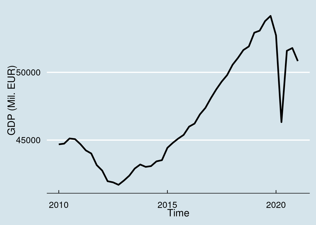
Quarterly GDP data receive big mass media attention as they highlight the current trends of the economy. In this sence it is a good idea to truncate the dataset to few recent quarters than to long time series. For example, the following example uses only the last two years:
namq_10_gdp %>%
  filter(geo == 'PT') %>%
  filter(unit == 'CP_MEUR') %>%
  filter(s_adj == 'SCA') %>%
  filter(na_item == 'B1GQ') %>%
  arrange(desc(time)) %>%
  top_n(8)  %>%
  ggplot(aes(x = time, y = values))  +
  geom_line(size = 1) +
  geom_point(size = 3) +
  labs(x = "Time", y = "GDP (Mil. EUR)") +
  theme_economist() +
  scale_color_economist() +
  theme(legend.position = "none") +
  theme(text = element_text(size = 16),
        axis.text = element_text(size = 14))
## Selecting by values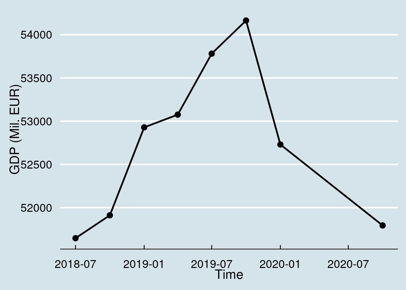
An improvement of this graph is to reformat thw x-axis labels for year/month to Q1, Q2, etc indicators of the quarters. Quarter indices in time series data are stored as dates, specifically the first date of the time period. Thus 2019-07-01 indicates the third quarter of the year 2019 (form July 1 to September 30). We can use the functions year/quarter (from the lubridate package) in order to extract the numeric value of the quarter:
namq_10_gdp %>%
  filter(geo == 'PT') %>%
  filter(unit == 'CP_MEUR') %>%
  filter(s_adj == 'SCA') %>%
  filter(na_item == 'B1GQ') %>%
  arrange(desc(time)) %>%
  mutate(quarter = quarter(time), year = year(time)) %>%
  mutate(Q = paste0(year, ":Q", quarter)) %>%
  top_n(8)  %>%
  ggplot(aes(x = Q, y = values, group = 1))  +
  geom_line(size = 1) +
  geom_point(size = 3) +
  labs(title = "GDP of Portugal", subtitle = "Mil. EUR, current market prices, last two years", x = "", y = "") +
  scale_x_discrete(guide = guide_axis(n.dodge = 2))+
  theme_economist() +
  theme(legend.position = "none") +
  theme(text = element_text(size = 16),
        axis.text = element_text(size = 14))
## Selecting by Q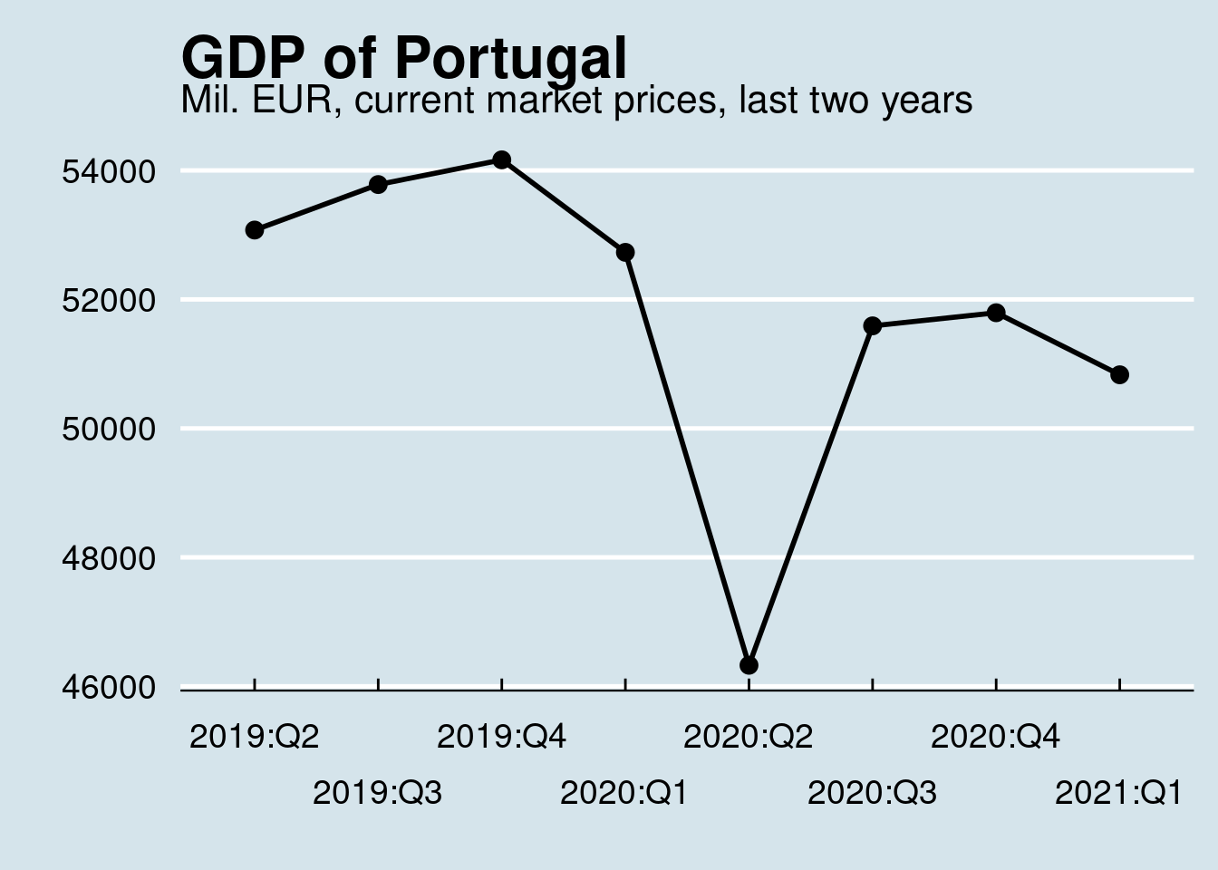
Please also note the group = 1 declaration in the aes of the plot. This is needed to draw the line since the x-axis contains now discrete values (2018:Q2, etc).
3.3.1 GDP growth
GDP growth, along with the unemployment rate, is one of the most popular economic indicators covered by the mass media. Especially during the last 10 years, the economic and sometimes the debt crisis in some eurozone coutnries brought the GDP growth data everywhere in the media. Let’s try to calculate and visualize these data.
GDP growth calculations are based on the chained linked volumes of the GDP, calibrated on the basis year. Any year can be used as a basis. Eurostat provides data calibrated on the years 2005, 2010, 2015. Some time in the near future also 2020 will be provied as well. We will use 2010 in the following examples, but the selection of the year does not affect the results.
Also GDP can be measured in national currencies or EUR, which happens to be the national currency in most of the coutries. The selection of currency does bot affect the GDP growth calculation. Since measurements in a common currency makes comparison easier we will stick on EUR.
Another important think related to changes of quarterly data is the selection of the reference period. Percentage of change can be easily calculated as:
\[\begin{equation} \text{% change}_{t} = 100 \times \frac{GDP_{t}-GDP_{t-1}}{GDP_{t-1}}, \,\,\, t = 2,3,4\ldots \end{equation}\]
This is the so called quarter-to-quarter change (Q-o-Q). However in order to account for seasonality of the data (even if we use seasonally adjusted data) it makes sense to compare GDP growth of the same quarter of the year (Y-o-Y). Which means we must calculate the GDP growth as: \[ \begin{equation} \text{% change}_{t} = 100 \times \frac{GDP_{t}-GDP_{t-4}}{GDP_{t-4}}, \,\,\, t = 5,6,7,\ldots \end{equation} \]
So, here is for example the percentage of GDP change for Portugal during last two years:
namq_10_gdp %>%
  filter(geo == 'PT') %>%
  filter(unit == 'CLV10_MEUR') %>%  #
  filter(na_item == 'B1GQ') %>%
  filter(s_adj == 'SCA') %>%
  select(time, values) %>%
  arrange(time) %>%
  mutate(pct = round(100*c(NA, diff(values, 1))/lag(values), 1)) %>%
  filter(is.na(pct) == FALSE) %>%
  tail(8)
## # A tibble: 8 × 3
## time values pct
## <date> <dbl> <dbl>
## 1 2019-04-01 47792. 0.6
## 2 2019-07-01 48020. 0.5
## 3 2019-10-01 48366. 0.7
## 4 2020-01-01 46450. -4
## 5 2020-04-01 39963. -14
## 6 2020-07-01 45328. 13.4
## 7 2020-10-01 45415. 0.2
## 8 2021-01-01 43970. -3.2And as usual we can easily plot the data:
namq_10_gdp %>%
  filter(geo == 'PT') %>%
  filter(unit == 'CLV10_MEUR') %>%  #
  filter(na_item == 'B1GQ') %>%
  filter(s_adj == 'SCA') %>%
  select(time, values) %>%
  arrange(time) %>%
  mutate(pct = round(100*c(NA, diff(values, 1))/lag(values), 1)) %>%
  mutate(quarter = quarter(time), year = year(time)) %>%
  mutate(Q = paste0(year, ":Q", quarter)) %>%
  filter(is.na(pct) == FALSE) %>%
  tail(8) %>%
  ggplot(aes(x = Q, y = pct, group = 1))  +
  geom_col(size = 1) +
  labs(title = "GDP growth of Portugal", subtitle = "percentage of change, last two years", x = "", y = "",
       caption = "Seasonally and calendar adjusted data, chained linked volumes") +
  scale_x_discrete(guide = guide_axis(n.dodge = 2))+
  theme_economist() +
  theme(legend.position = "none") +
  theme(text = element_text(size = 16),
        axis.text = element_text(size = 14))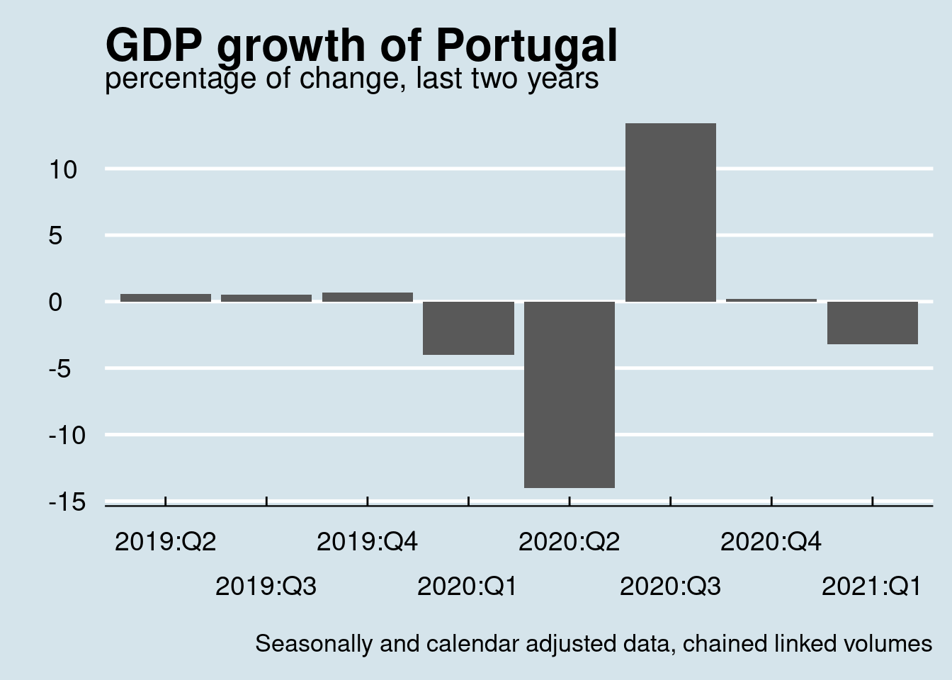
Sometimes color differentiation of positive nad negative values might help to better highlight the differences:
namq_10_gdp %>%
  filter(geo == 'PT') %>%
  filter(unit == 'CLV10_MEUR') %>%  #
  filter(na_item == 'B1GQ') %>%
  filter(s_adj == 'SCA') %>%
  select(time, values) %>%
  arrange(time) %>%
  mutate(pct = round(100*c(NA, diff(values, 1))/lag(values), 1)) %>%
  mutate(quarter = quarter(time), year = year(time)) %>%
  mutate(Q = paste0(year, ":Q", quarter)) %>%
  mutate(Color = ifelse(pct >= 0, "blue", "red")) %>%
  filter(is.na(pct) == FALSE) %>%
  tail(8) %>%
  ggplot(aes(x = Q, y = pct, fill = Color))  +
  geom_col(width = 0.8) +
  labs(title = "GDP growth of Portugal",
       subtitle = "percentage of change, last two years",
       x = "", y = "",
       caption = "Seasonally and calendar adjusted data, chained linked volumes") +
  scale_x_discrete(guide = guide_axis(n.dodge = 2))+
  scale_fill_identity() +
  theme_economist() +
  theme(legend.position = "none") +
  theme(text = element_text(size = 16),
        axis.text = element_text(size = 14))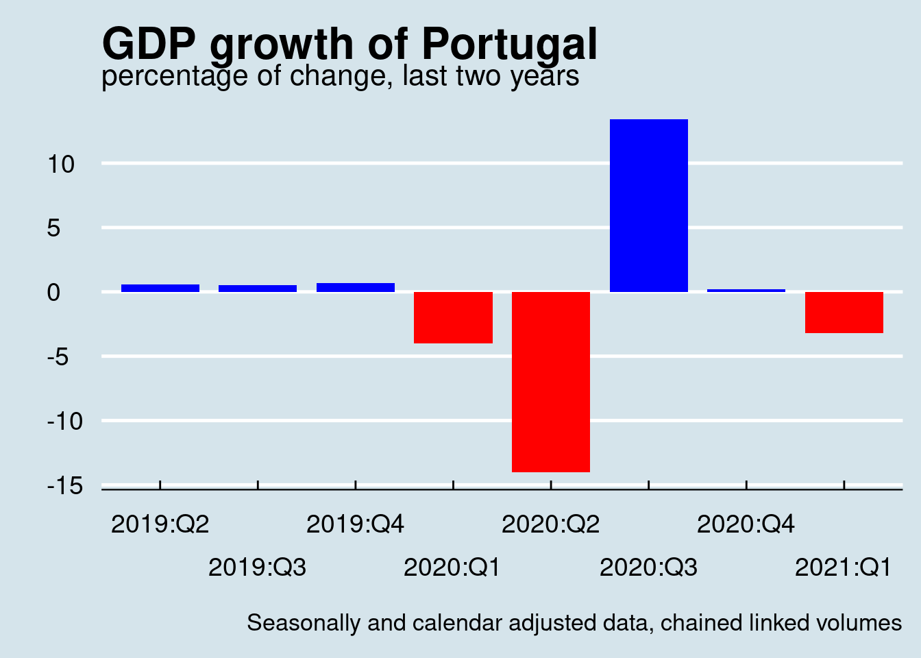
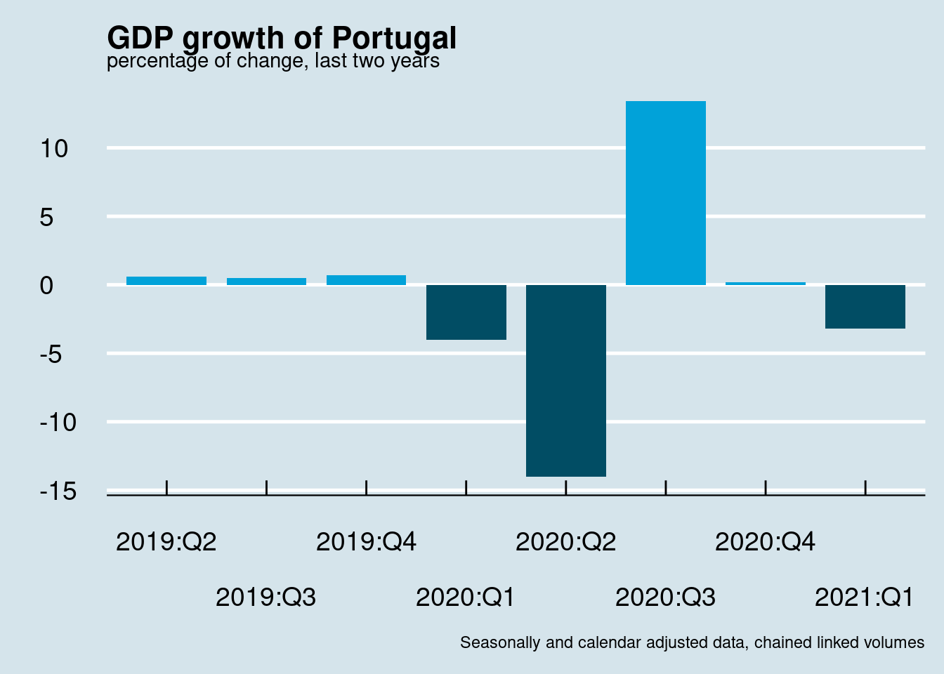
The above example uses user-defined colors, however colors can be adjusted to any them used. For example:
will produce the following plot:
The above plot was about GDP change relatively to the previous quarter, the so called quarter to quarter change (Q-o-Q). As stated previously it is also important to calculate and compare GDP changes relatively to the same quarter of the previous year. In this case we need to adapt the calculations as:
So, calculations and the final plot should look like:
namq_10_gdp %>%
  filter(geo == 'PT') %>%
  filter(unit == 'CLV10_MEUR') %>%  #
  filter(na_item == 'B1GQ') %>%
  filter(s_adj == 'SCA') %>%
  select(time, values) %>%
  arrange(time) %>%
  mutate(pct = round(100*c(rep(NA, 4), diff(values, 4))/lag(values, 4), 1)) %>%
  mutate(quarter = quarter(time), year = year(time)) %>%
  mutate(Q = paste0(year, ":Q", quarter)) %>%
  mutate(Color = ifelse(pct >= 0, "blue", "red")) %>%
  filter(is.na(pct) == FALSE) %>%
  tail(8) %>%
  ggplot(aes(x = Q, y = pct, fill = Color))  +
  geom_col(width = 0.8) +
  labs(title = "Quarterly GDP growth of Portugal",
       subtitle = "\nY-o-Y percentage of change, last two years",
       x = "", y = "",
       caption = "Seasonally and calendar adjusted data, chained linked volumes\nSource: Eurostat namq_10_gdp") +
  scale_x_discrete(guide = guide_axis(n.dodge = 2))+
  scale_fill_economist() +
  theme_economist(base_size = 16) +
  theme(axis.text = element_text(size = 14)) +
theme(legend.position = "none") 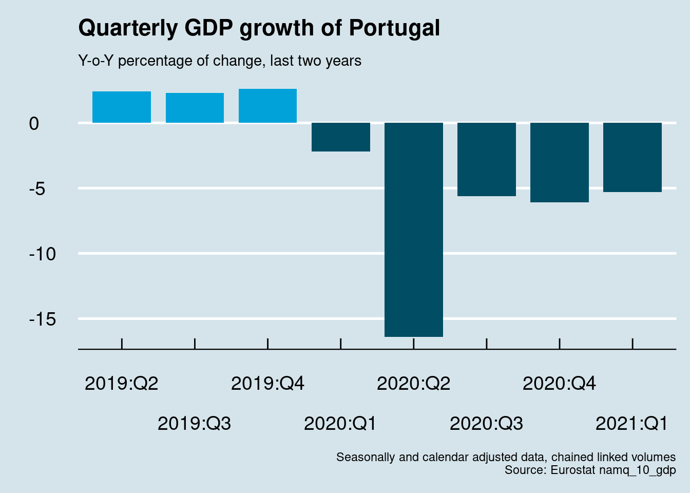
Another similar topic is the comparison between different countries. For example we can compare Portugal to Greece and also Germany. Here attention must be given to appropriately grouping the initial dataset (per country), in order to calculate correctly the GDP growht rates.
For example, see below:
namq_10_gdp %>%
  filter(time >= '2001-01-01' & time < max(time)) %>%
  filter(geo %in% c('PT', 'EL', 'EA', 'DE')) %>%
  filter(unit == 'CLV10_MEUR') %>%  #
  filter(na_item == 'B1GQ') %>%
  filter(s_adj == 'SCA') %>%
  select(geo, time, values) %>%
  arrange(time) %>%
  group_by(geo) %>%
  mutate(pct = round(100*c(rep(NA, 4), diff(values, 4))/lag(values, 4), 1)) %>%
  tail()
## # A tibble: 6 × 4
## # Groups: geo [4]
## geo time values pct
## <chr> <date> <dbl> <dbl>
## 1 EL 2020-10-01 44196. -6.9
## 2 PT 2020-10-01 45415. -6.1
## 3 DE 2021-01-01 712416. -3.2
## 4 EA 2021-01-01 2551534. -1.3
## 5 EL 2021-01-01 46152. -2.3
## 6 PT 2021-01-01 43970. -5.3without the:
calculation of percentage of change will not correct, simply because the formula applied will mix numbers between different countries.
Since we get the correct results we may procceed with plotting the data:
cntr_names <- eu_countries %>%
  select(geo = code, Country = name)

namq_10_gdp %>%
  filter(time >= '2001-01-01' & time < max(time)) %>%
  filter(geo %in% c('PT', 'EL', 'DE')) %>%
  filter(unit == 'CLV10_MEUR') %>%  #
  filter(na_item == 'B1GQ') %>%
  filter(s_adj == 'SCA') %>%
  select(geo, time, values) %>%
  inner_join(cntr_names, by = "geo") %>%
  arrange(time) %>%
  group_by(geo) %>%
  mutate(pct = round(100*c(rep(NA, 4), diff(values, 4))/lag(values, 4), 1)) %>%
  ungroup() %>%
  mutate(quarter = quarter(time), year = year(time)) %>%
  mutate(Q = paste0(year, ":Q", quarter)) %>%
  filter(is.na(pct) == FALSE) %>%
  ggplot(aes(x = time, y = pct, colour = Country, group = Country))  +
  geom_line(size = 1.2) +
  labs(title = "Quarterly GDP growth",
       subtitle = "Y-o-Y percentage of change from 2002",
       x = "Time", y = "% of change",
       caption = "Seasonally and calendar adjusted data, chained linked volumes
       Source: Eurostat namq_10_gdp") +
  scale_colour_wsj() +
  theme_minimal(base_size = 15) +
  theme(legend.position = c(0.85, 0.20),
        legend.title = element_blank(),
        legend.background=element_blank())
Another interesting think is calculate and visualize recession periods, thus at least two consecutive quarters of economic decline (negative GDP growth). For example, we will examine Germany for the whole period data are available. In order to calculate this we need to apply a trick, something like:
namq_10_gdp %>%
  filter(geo == 'DE') %>%
  filter(unit == 'CLV10_MEUR') %>%  #
  filter(na_item == 'B1GQ') %>%
  filter(s_adj == 'SCA') %>%
  select(time, values) %>%
  arrange(time) %>%
  mutate(pct = round(100*c(rep(NA, 1), diff(values, 1))/lag(values, 1), 1)) %>%
  filter(is.na(pct) == FALSE) %>%
  mutate(a = ifelse(pct<0, 1, 0)) %>%
  mutate(recession = ifelse(row_number() == 1, a, a*lag(a))) %>%
  mutate(b = lead(recession)) %>%
  mutate(recession = ifelse(recession == 0, a*b, recession)) %>%
  select(-c(a, b))
## # A tibble: 121 × 4
## time values pct recession
## <date> <dbl> <dbl> <dbl>
## 1 1991-04-01 510853. -0.5 1
## 2 1991-07-01 509738. -0.2 1
## 3 1991-10-01 516359. 1.3 0
## 4 1992-01-01 524218. 1.5 0
## 5 1992-04-01 520176. -0.8 1
## 6 1992-07-01 519270. -0.2 1
## 7 1992-10-01 517597. -0.3 1
## 8 1993-01-01 513868. -0.7 1
## 9 1993-04-01 513728. 0 0
## 10 1993-07-01 516795. 0.6 0
## # … with 111 more rowsWhere a, b were auxilary variables (dropped on a later stage) and recession defines (1 or 0) if a specific quarter belongs to a recession period, a period with at least two consecutive quarters with negative GDP growth. Along with a plot similar to previous ones we can also add some ribbons to highlight these periods.
namq_10_gdp %>%
  filter(geo == 'DE') %>%
  filter(unit == 'CLV10_MEUR') %>%  #
  filter(na_item == 'B1GQ') %>%
  filter(s_adj == 'SCA') %>%
  select(time, values) %>%
  arrange(time) %>%
  mutate(pct = round(100*c(rep(NA, 1), diff(values, 1)) / lag(values, 1), 1)) %>%
  filter(is.na(pct) == FALSE) %>%
  mutate(a = ifelse(pct < 0, 1, 0)) %>%
  mutate(recession = ifelse(row_number() == 1, a, a*lag(a))) %>%
  mutate(recession = ifelse(recession == 1, recession, a*lead(a))) %>%
  group_by(grp = cumsum(c(1, diff(recession)) != 0)) %>%
  ungroup() %>%
  select(-a) %>% {
    ggplot() +
    geom_ribbon(data = filter(., recession == 1),
                aes(x = time - 45, group = grp, ymax = Inf, ymin = -Inf),
                fill = "bisque2") +
    geom_ribbon(data = filter(., recession == 1),
                aes(x = time + 45, group = grp, ymax = Inf, ymin = -Inf),
               fill = "bisque2") +
    geom_hline(yintercept = 0, color = "red", linetype = 2) +
    geom_line(data = ., aes(x = time, y = pct), size = 1, color = "blue")
    } +
    labs(title = "Germany's quarterly GDP growth",
         subtitle = "Q-o-Q percentage of change",
         x = "Time", y = "% of change",
         caption = "Seasonally and calendar adjusted data, chained linked volumes
         Source: Eurostat namq_10_gdp") +
    theme_minimal(base_size = 15) +
    theme(legend.position = c(0.85, 0.20),
          legend.title = element_blank(),
legend.background = element_blank()) 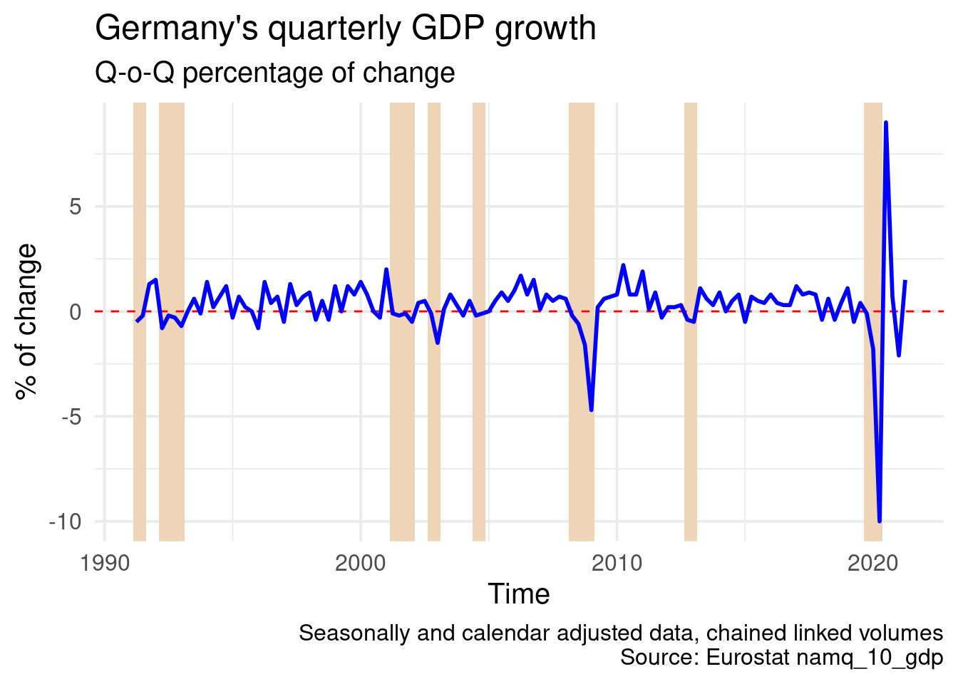
3.4 Monthly data, inflation as example
Libraries we will use in this section:
library(tidyverse)
library(eurostat)
library(sf)
library(scales)
library(lubridate)
library(ggrepel)
library(ggthemes)
library(gghighlight)
library(wesanderson)
library(gfonts)
Table prc_hicp_cind contains the harmonized index of consumer prices and gives comparable measures of inflation across EU countries. Data can be download via the standard way:
Or the annual rate of change in price indices:
It is a big dataset since it contains monthly data for several hundreds goods and services. As it is obvious it follows the Eurostat’s classification of goods and services, main indicators are:
- 00 - All-items (total or all-items index)
- 01 - Food and non-alcoholic beverages
- 02 - Alcoholic beverages and tobacco
- 03 - Clothing and footwear
- 04 - Housing, water, electricity, gas and other fuels
- 05 - Furnishings, Household equipment and routine maintenance of the house
- 06 - Health
- 07 - Transport
- 08 - Communication
- 09 - Recreation and culture
- 10 - Education
- 11 - Restaurants and hotels
- 12 - Miscellaneous goods and services
And also the four main aggreagates about:
- Energy (NRG)
- Food, alcohol and tobacco (FOOD)
- Non-energy industrial goods (IGD_NNRG)
- Services (NRG)
LABELS <- tribble(~coicop, ~label,
                  "CP00", "All items",
                  "FOOD", "Food, alch. & tabacco",
                  "IGD_NNRG", "Non-energy ind. goods",
                  "SERV", "Services",
                  "NRG", "Energy")

EU_countries <- eu_countries %>%
  rename(geo = code) %>%
  select(geo, name)
EA_countries <- ea_countries %>%
  rename(geo = code) %>%
  select(geo, name)

EA_hicp <- prc_hicp_manr %>%
  filter(time >= '2010-01-01') %>%
  filter(geo == 'IT') %>%
  inner_join(LABELS, by = "coicop")

plt <- EA_hicp %>%
  ggplot(aes(x = time, y = values, colour = label)) +
  geom_line(size = 1.25) +
  geom_point(data = EA_hicp[1:5, ], aes(x = time, y = values),  size = 4, alpha = 0.7) +
  labs(x = "", y = "", title = "Euro Area annual inflation and its main components") +
  scale_x_date(labels = date_format("%Y-%m"), breaks = "12 months") +
  theme_economist() +
  theme(text = element_text(size = 10)) +
  theme(axis.text.x = element_text(angle = 30, hjust = 1, vjust = 1)) +
  theme(legend.title = element_blank()) +
  guides(colour = guide_legend(override.aes = list(size = 2, stroke = 0))) +
  scale_colour_brewer(type = "qual", palette = 6)
plt
mon1 <- floor_date(Sys.Date() - months(1), "month")
mon2 <- floor_date(Sys.Date() - months(2), "month")
mon1_name <- months(as.Date(mon1))
mon2_name <- months(as.Date(mon2))
mon1_year <-year(mon1)
mon2_year <- year(mon2)

infl_cur <- prc_hicp_manr %>%
  filter(geo == 'EA' & coicop == 'CP00' & time == mon1) %>%
  pull(values) %>%
  formatC(format = "f", digits = 1)

infl_pev <- prc_hicp_manr %>%
  filter(geo == 'EA' & coicop == 'CP00' & time == mon2) %>%
  pull(values) %>%
  formatC(format = "f", digits = 1)


EA_countries <- ea_countries %>%
  select(geo = code, Country = name)

prc_hicp_manr %>%
  filter(coicop == 'CP00') %>%
  filter(time >= '2009-01-01') %>%
  inner_join(EA_countries) %>%
  ggplot(aes(x = time, y = values)) +
  geom_line(size = 0.75, color = "blue") +
  labs(x = "", y = "", title = "Euro Area annual inflation by Country") +
  scale_x_date(labels = date_format("%y"), breaks = "24 months") +
  facet_wrap(~Country) +
  theme_economist() +
  theme(strip.text.x = element_text(size = 11, face="bold")) +
  theme(text = element_text(size = 10)) +
  theme(axis.text.x = element_text(angle = 00, hjust = 0.5, vjust = 1)) +
  theme(legend.title = element_blank()) +
  guides(colour = guide_legend(override.aes = list(size = 2, stroke = 0))) +
  scale_colour_brewer(type = "qual", palette = 6)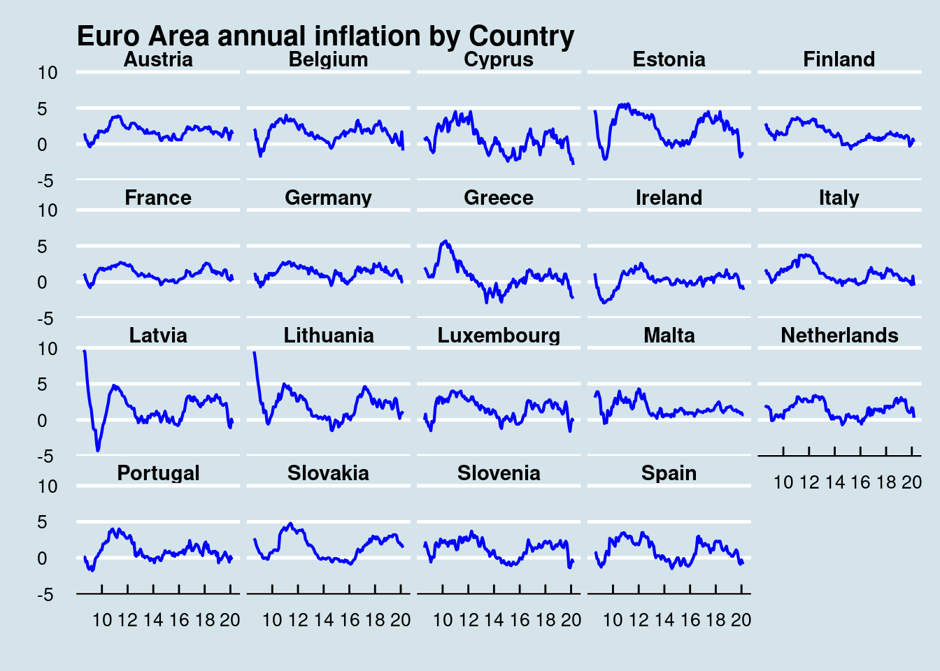
prc_hicp_manr %>%
  filter(coicop == 'CP00') %>%
  filter(time >= '2009-01-01') %>%
  filter(geo %in% c('EL', 'PT', 'IE')) %>%
  inner_join(EA_countries) %>%
  ggplot(aes(x = time, y = values, colour = Country, group = Country)) +
  geom_line(size = 1) +
  labs(x = "", y = "", title = "") +
  scale_x_date(labels = date_format("%y"), breaks = "24 months") +
  #facet_wrap(~Country) +
  theme_economist() +
  theme(strip.text.x = element_text(size = 14, face="bold")) +
  theme(text = element_text(size = 14)) +
  theme(axis.text.x = element_text(angle = 00, hjust = 0.5, vjust = 1)) +
  theme(legend.title = element_blank()) +
  guides(colour = guide_legend(override.aes = list(size = 2, stroke = 0))) +
  scale_colour_brewer(type = "qual", palette = 6)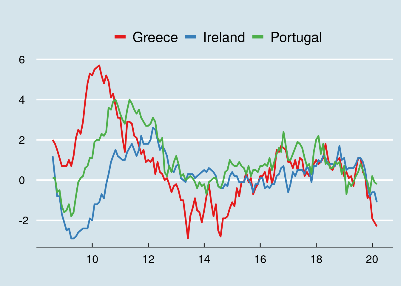
3.4.1 Price index of a good, potatoes as examble
Food prices might be affected by many factors, monetary policy as well. This is not a place to discuss inflation and price volatility, but it is a good place to look around the data and have a glance.
We will take potato price index as example to examine the price volatility of common food consumed all across Europe. Price indices are stored in the prc_hicp_midx table. We will use the 2015 based index (I15) and potato has coipop = CP01174. This is the price index of potato for the EU28 average:
## # A tibble: 38 × 5
## unit coicop geo time values
## <chr> <chr> <chr> <date> <dbl>
## 1 I15 CP01174 EU28 2020-01-01 120.
## 2 I15 CP01174 EU28 2019-12-01 120.
## 3 I15 CP01174 EU28 2019-11-01 119.
## 4 I15 CP01174 EU28 2019-10-01 120.
## 5 I15 CP01174 EU28 2019-09-01 123.
## 6 I15 CP01174 EU28 2019-08-01 130.
## 7 I15 CP01174 EU28 2019-07-01 134.
## 8 I15 CP01174 EU28 2019-06-01 137.
## 9 I15 CP01174 EU28 2019-05-01 134.
## 10 I15 CP01174 EU28 2019-04-01 126
## # … with 28 more rowsAnd if wanted we can of course plot the series:
prc_hicp_midx %>%
  filter(unit == "I15") %>%
  filter(coicop == 'CP01174') %>%
filter(geo == 'EU28') %>%
ggplot(aes(x = time, y = values)) +
geom_line() +
labs(x = "Time", y = "Price Index",
title = "Price index of Potatoes in EU28",
subtitle = "Base year 2015",
caption = "Source: Eurostat prc_hicp_midx ") +
theme_minimal()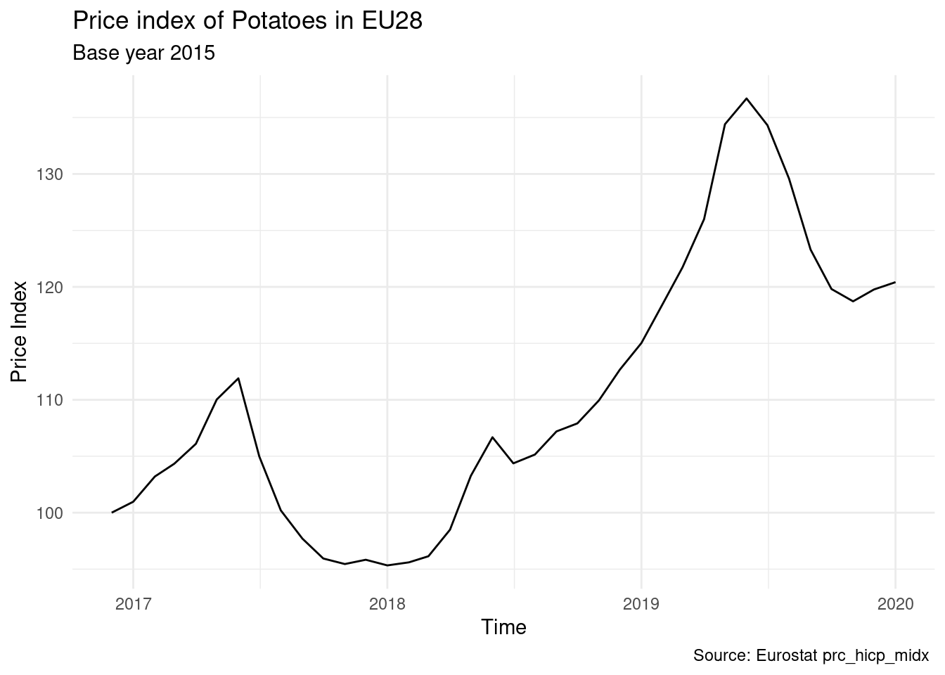
Or we can compare between countries, for example France and Germany:
EU_countries <- eu_countries %>%
  select(geo = code, Country = name)

prc_hicp_midx %>%
  filter(unit == "I15") %>%
  filter(coicop == 'CP01174') %>%
  filter(geo %in% c('DE', 'FR')) %>%
  inner_join(EU_countries) %>%
  ggplot(aes(x = time, y = values, colour = Country)) +
  geom_line() +
  labs(x = "Time", y = "Price Index",
       title = "Price index of Potatoes",
       caption = "Source: Eurostat prc_hicp_midx\nBase year = 2015") +
theme_minimal(base_size = 16) 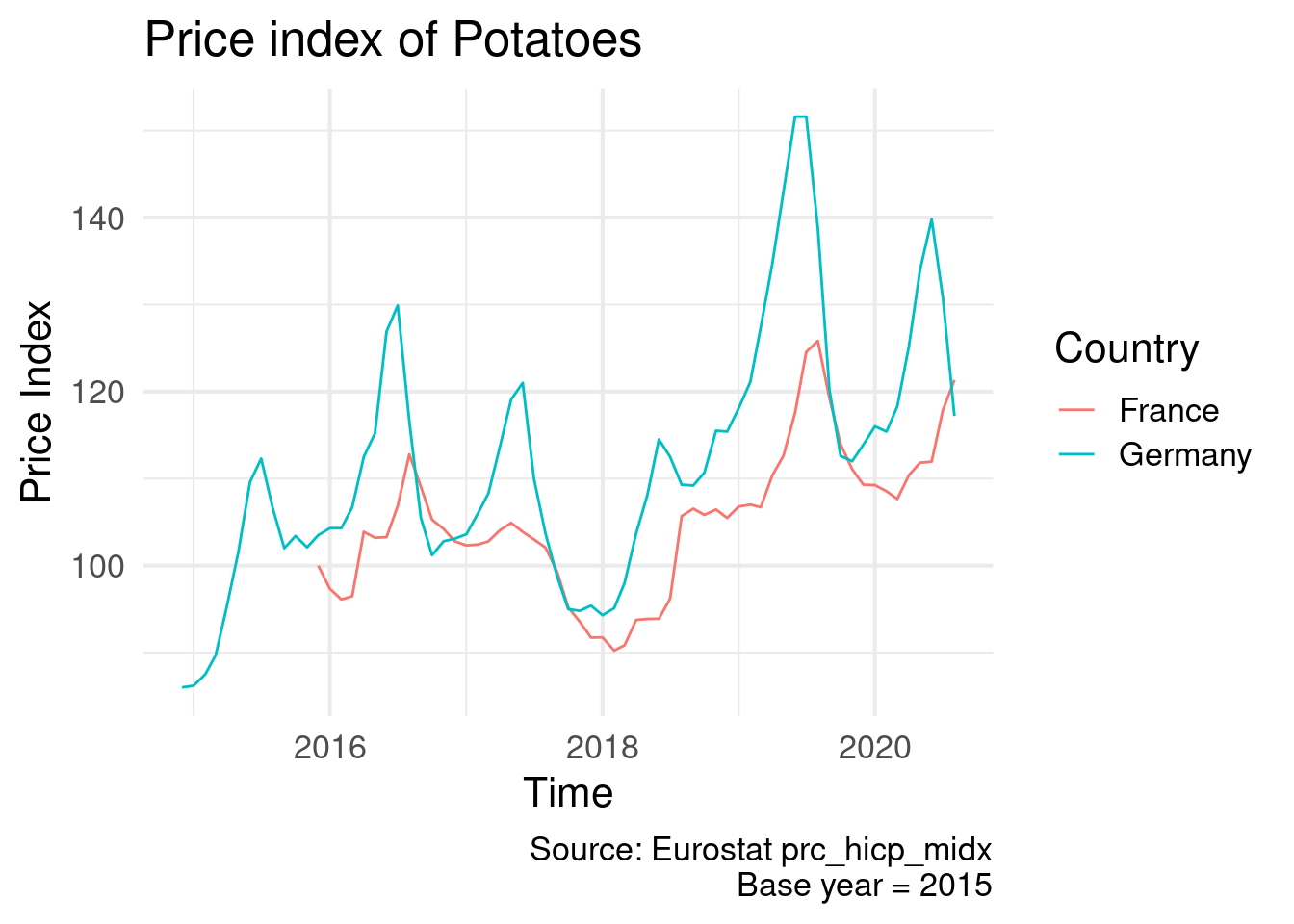
Another very usefull related table is the prc_hicp_manr, which provides the annual annual rates of change (m/m-12). Eurostat also provides the prc_hicp_mmor tables about monthly rates of change (m/m-1), however here are only going to look to annual changes. For example we can extract and plot the annual change of potato price index in Belgium:
prc_hicp_manr %>%
  filter(unit == "RCH_A") %>%
  filter(coicop == 'CP01174') %>%
  filter(geo == 'BE') %>%
  ggplot(aes(x = time, y = values)) +
  geom_line() +
  labs(x = "Time", y = "% Change",
       title = "Annual change of potato price index in Belgium",
       caption = "Source: Eurostat prc_hicp_manr") +
  theme_minimal(base_size = 14)
A nice way to highlight Belgium compared to all other EU countries is this:
prc_hicp_manr %>%
  filter(unit == "RCH_A") %>%
  filter(coicop == 'CP01174') %>%
  filter(time > '2015-01-01') %>%
  inner_join(EU_countries) %>%
  ggplot(aes(x = time, y = values, colour = Country)) +
  geom_line() +
  gghighlight(geo == "BE", use_group_by = FALSE, use_direct_label = FALSE) +
  labs(x = "Time", y = "% Change",
       title = "Annual change of potato price index in Belgium",
       subtitle = "in comparison with all other EU28 countries",
       caption = "Source: Eurostat prc_hicp_manr") +
  scale_colour_brewer(type = "qual", palette = 6) +
  theme_minimal(base_size = 14) +
  guides(colour = FALSE)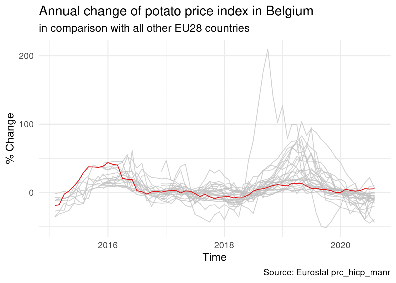
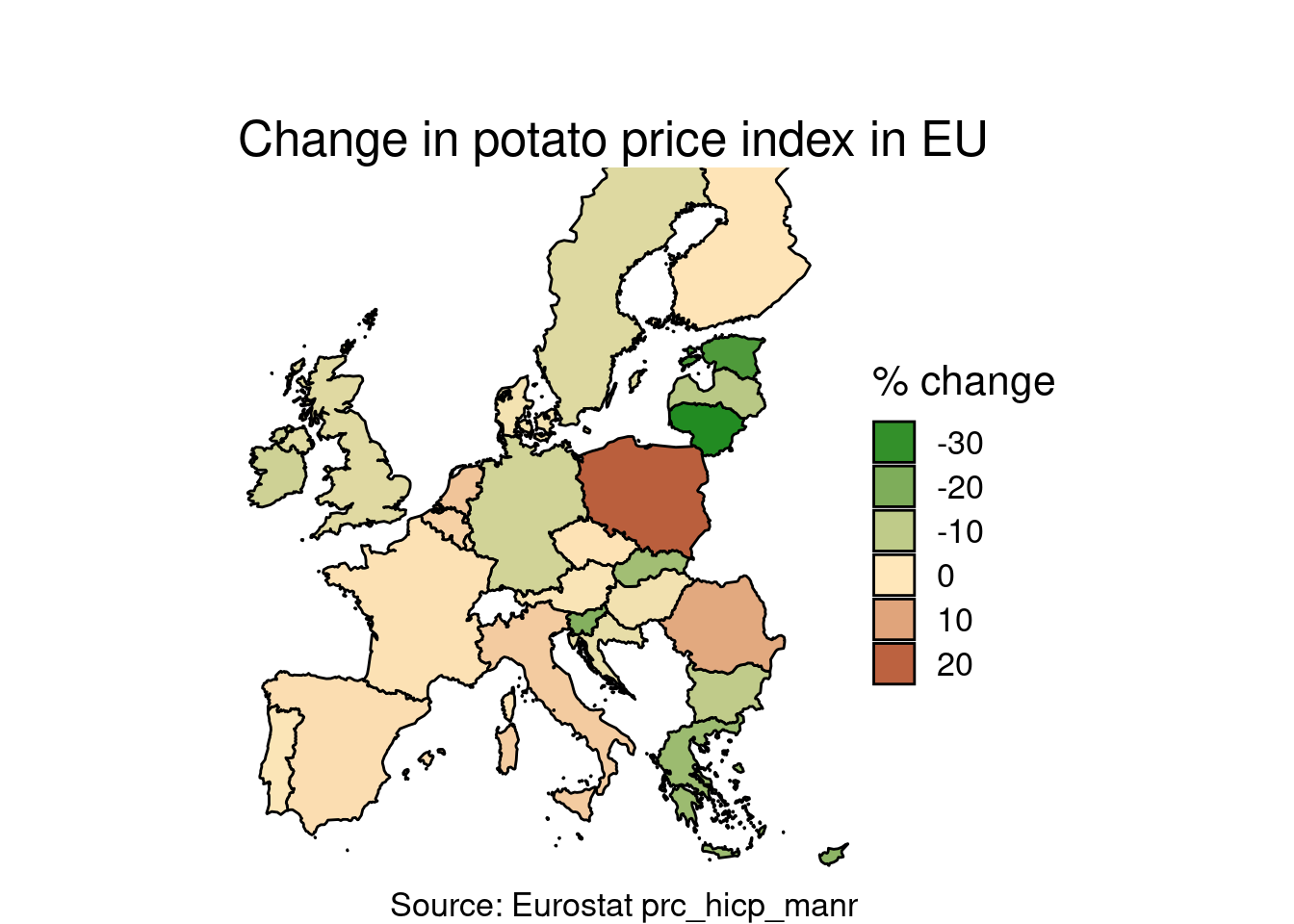
And now let’s put in the map. Here is a way to plot annual rate of change in potato price index in EU28 countries for a specific month. Let us choose May 2019, the month of the EU parliament elections.
First, we download (if not done already) the shapefiles of EU countries, joined with the EU28 countries:
EU_shp <- get_eurostat_geospatial(resolution = 10,
                                 nuts_level = 0,
                                 year = 2016) %>%
  select(geo = CNTR_CODE, geometry) %>%
  semi_join(EU_countries) %>%
  st_as_sf()
Then we select a specific month (here March 2020), join with shapefile, and plot a choropleth map:
prc_hicp_manr %>%
  filter(unit == "RCH_A") %>%
  filter(coicop == 'CP01174') %>%
  filter(time == '2020-03-01') %>%
  inner_join(EU_shp) %>%
  st_as_sf() %>%
  ggplot() +
  geom_sf(aes(fill = values), color = "black") +
  scale_x_continuous(limits = c(-9, 33)) +
  scale_y_continuous(limits = c(35.5, 66)) +
  theme_void() +
  theme(text = element_text(size = 16)) +
  labs(title = "\n\nChange in potato price index in EU",
       susitile = "March 2020, annual rate of change",
       caption = "Source: Eurostat prc_hicp_manr") +
  scale_fill_gradient2(low = "forestgreen",
                       mid = "wheat1",
                       high = "red4",
                       midpoint = 0,
                       space = "Lab",
                       na.value = "grey80") +
  guides(fill = guide_legend(title = "% change"))